There were 19 projects this semester, so this group has its own page. | Back to InfoVis Projects
InfoVis Spring 2017 Class Projects @ WS-DL blog
Insights into American Football (Mahesh, Maheedhar) | demo video
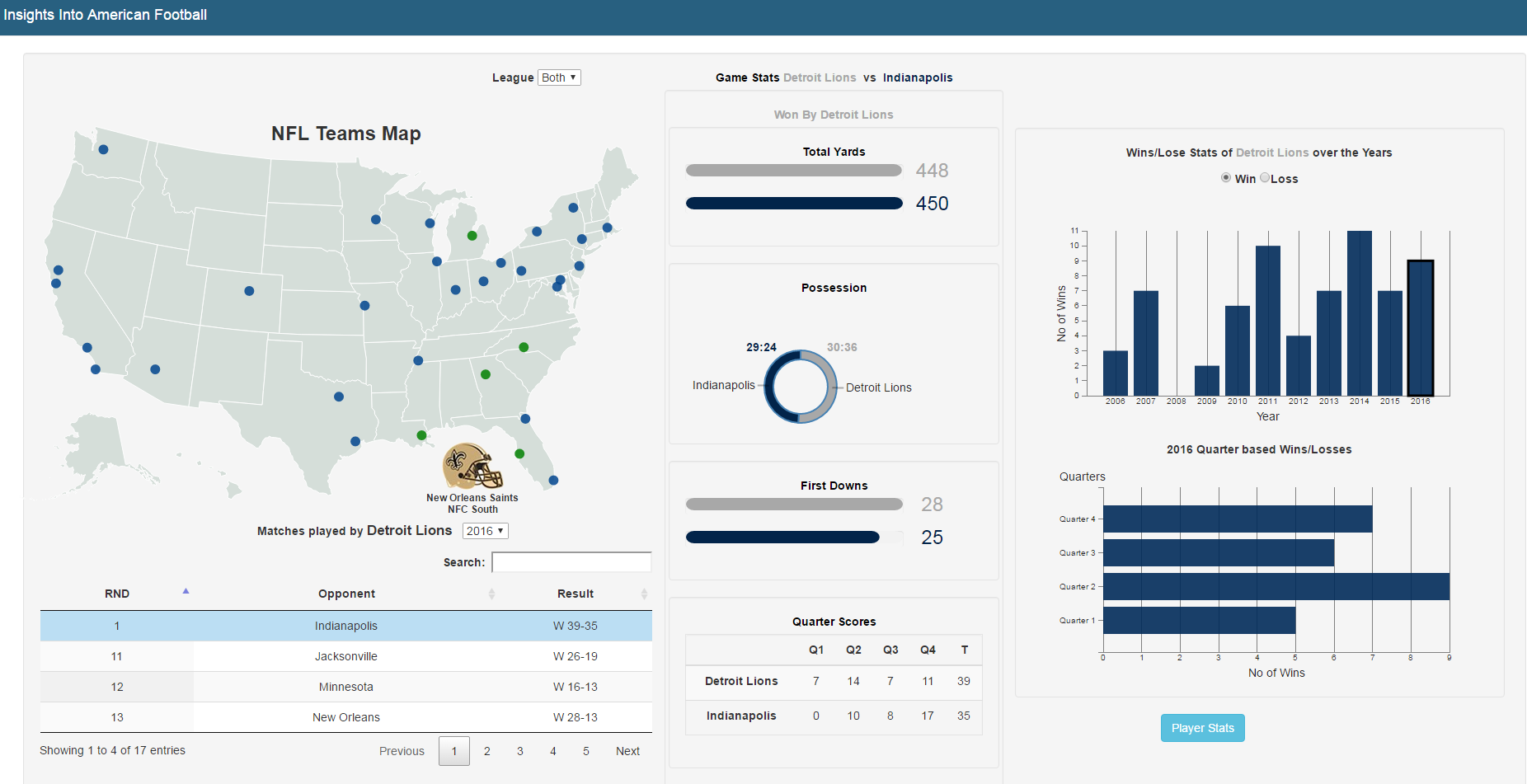 | This project presents a visualization interface to explore the football data and find some interesting aspects of the game over the past 10 years. Most of the sport websites which are followed merely show the game statistics in a tabular data format, which get more difficult for the user to perceive at a first glance. Different idioms like multi-line chart, bar chart, radar and donut charts are used to effectively visualize the football dataset, which aims at providing a platform for the users to help them explore and find some interesting insights that may go unnoticed. |
Visualization of US Refugee Admittance Data (Susan) | demo video
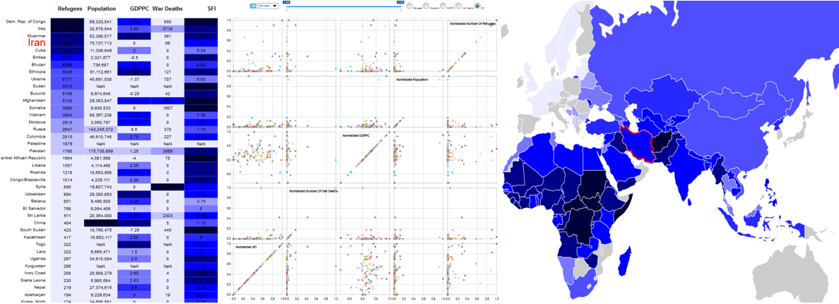 | After President Donald Trump's signing of the recent executive orders, immigration to the United States (US) has become the subject of significant debate, with questions about the mass of inflows, the religion of refugees, refugee restrictions, etc. In this project, a wide range of publicly available datasets were utilized in order to create visualization of accurate and unbiased current and historical information about refugee immigration. By visually encoding some of the most frequently requested facts and figures on US immigration related to refugee admission, this project answers some of the important questions such as the number of refugees by country of nationality/religion, and relation between a country's number of refugees, number of w ar deaths, population, GDP per capita (GDPPC), and State Fragility Index (SFI). The main contribution of this work is to bring together US refugee admittance data with other data related to the number of war deaths, GDPPC, population, and SFI. The fusion of various datasets facilitate a user to perform both breadth and depth analysis in a single application. The project was implemented using D3 and NVD3 library, and tested on Firefox browser on a desktop with Windows 10 operating system. |
Visualize Sales & Ecommerce Trends at Amazon, products vis (Raja Harsha) | demo video
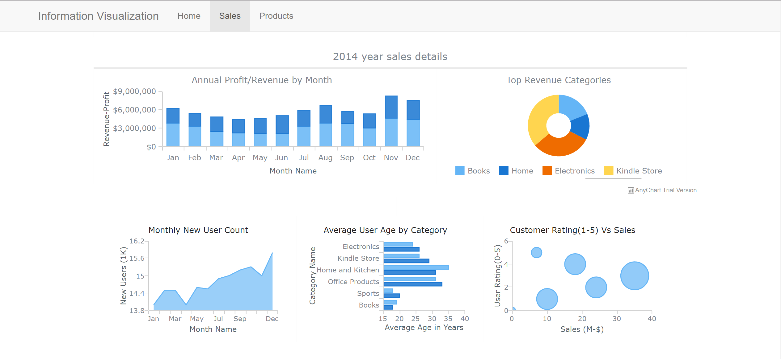 | The aim of this project is to analyze Amazon sales data over a period and create a visualization dashboard which helps business users to draw key insights. Often Ecommerce companies assess their business trends in various sales segments and make decisions with the help of results from sophisticated visualization platforms. The author analyzed the data obtained from the Amazon product metadata, transactions dataset to produce some interactive visualization using D3.js, HighCharts.js and AnyCharts.js to show summarized results over the years. SentenTree is a new novel visualization tool used for visualizing unstructured data like tweets is applied in context of user reviews and results are observed. |
Sentiment analysis based on social media (Triveni) | demo video
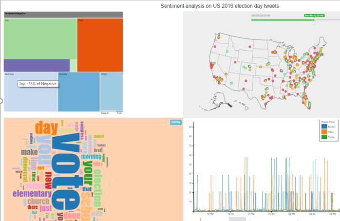 | Sentiment analysis is growing fast as a research topic and there are many tools to analyse text extracted from social media sites/websites and open source datasets. Many social media sites provide user data for research purposes . Data is fed into data cleaning and organizing tools and visualizations are drawn based on the input data.In this paper emotion analysis is presented in addition to sentiment analysis as a visualization using D3 charting libraries instead of visualization tools. This provides more customization scope to developers and detailed information to users with no knowledge of tools like Tableau, R, Trifacta etc. can use visualization to analyse sentiment trends of a given data in a particular time. |
Environment Data Visualization (Matt) | demo video
 | Climate change is a heated topic of debate among members of the United States Government. Both sides have arguments as to the validity of the science behind the idea that humankind has contributed to the overall planetary increase in average temperature over the past 100 years. This project aims to shed just a modicum of light on this topic by selecting a climate-change related dataset and visualizing the data therein to allow a user to decide for themselves whether or not this data shows that global warming is indeed an effect of human origin, or if there is actually no correlation at all between the spread and growth of the global human population and the increase in the planet’s temperature. Using D3, a modern Javascript visualization library, simple HTML and a few other supporting libraries, I was able to construct a visualization that allows a user to browse a number of possible climate-changing attributes on a per-country basis over hundreds of countries to allow users find correlations and other patterns between two of many attributes from a publicly available climate change dataset. |
Visualizing University’s Course Enrollment Patterns (Nishant)
 | Visualization is an interesting concept which helps analyze data visually and it is very effective when implemented using appropriate designs and idioms. Considering data collected in a particular department in a University is large and easier to understand and analyze if represented visually. In this Project, the idea is to make students and faculties get a clear picture of how the courses are offered over different semesters through many years. The dataset considered is “Course Listing of Computer Science Department, Old Dominion University”. It is shown through different visualization techniques how student enrollments generally vary between semesters. The major goal of this project is to help students to plan their courses ahead of time by observing the pattern of enrollments and to help faculties to plan and offer their courses in appropriate semesters depending on the pattern followed. To achieve this, four different types of designs are implemented which show the results. |
Demographics of International Students in the United States (Ram, Yasaswini) | demo video
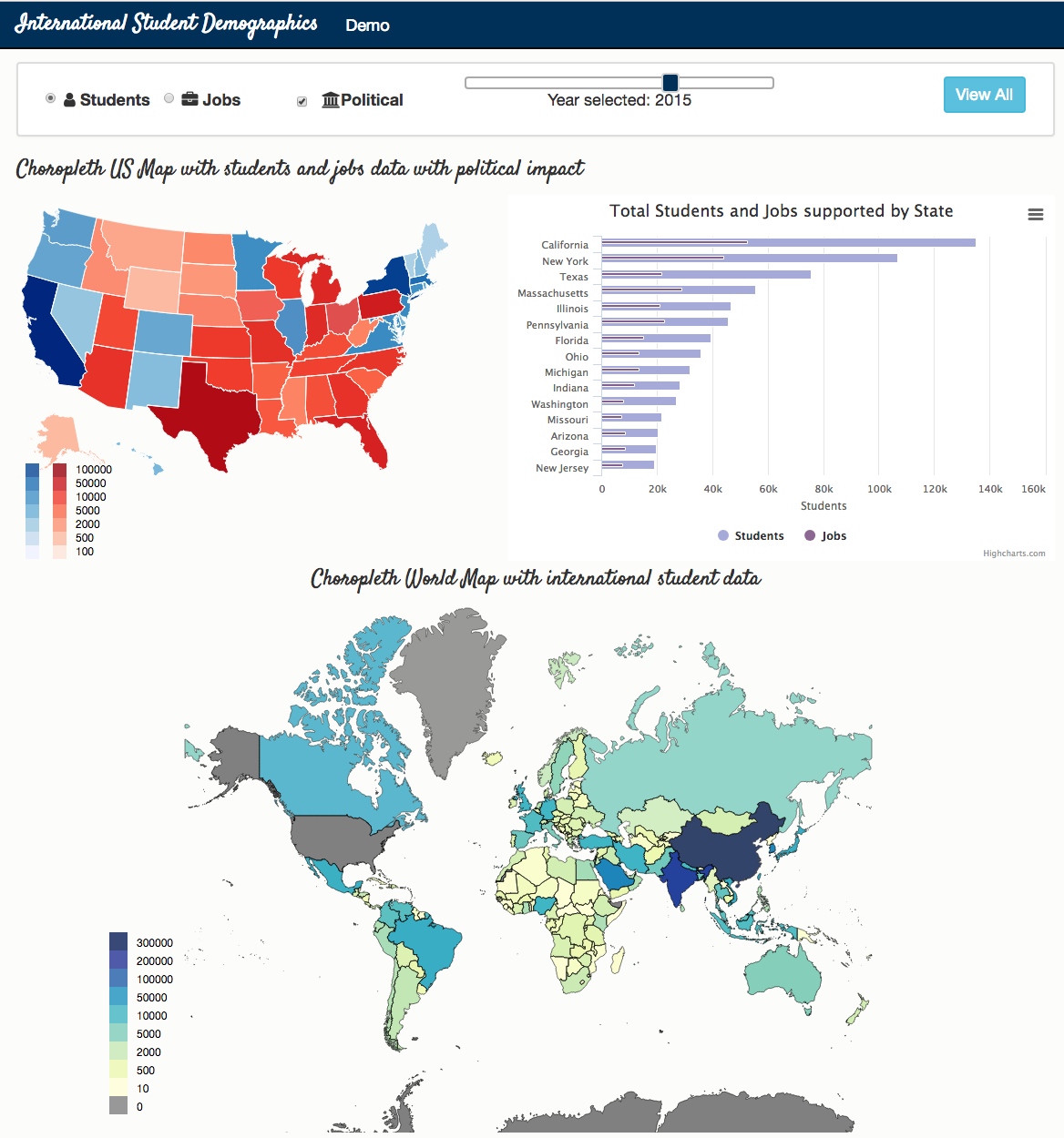 | The USA is leading with the largest population of international students. With the recent political impact, international students and their respective job toll might have long term effects. Taking this into consideration, we developed a web-based visualization which is likely to show the benefits of having international students in the US. We achieved this by considering and comparing various factors like revenue and jobs contributed by students in each state to the student headcount, which also helps derive the impact of recent politics in these states on international education system. Also, we are showing the distribution of incoming students from different countries over years in a multi-hued choropleth map. The goal of the project is to favor the international student education by analyzing this distribution to the US states student’s headcount and by comparing several attributes on international education system, marking its contribution to the United States. |
Population of countries between 1980 and 2010 (Vikas) | demo video
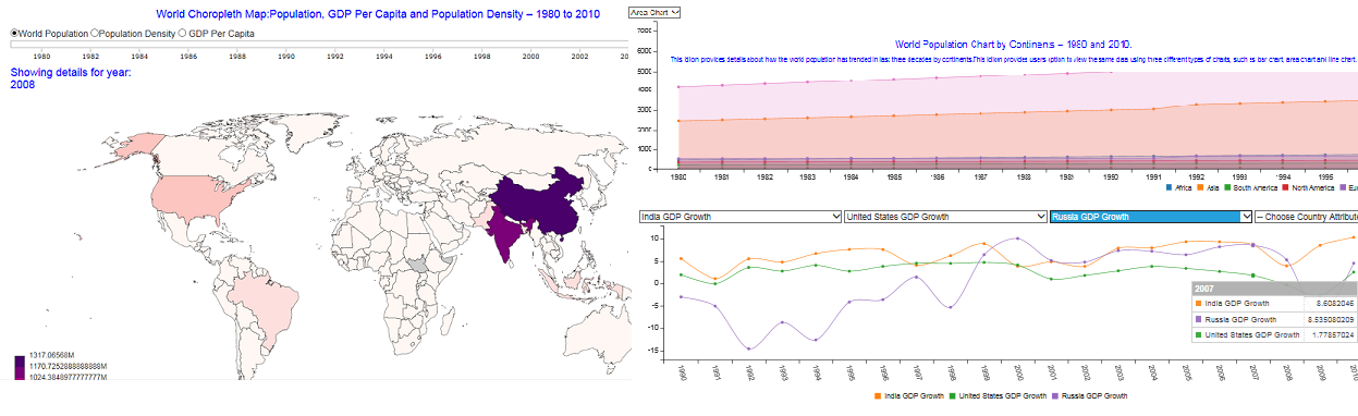 | The following contributions are made in this project: (1) Present details about how the world population has trended in last three decades, including trend details of all the continents and individual countries. (2) Provide details about the impact or influence of population trend on the associated developmental indicators such as Social, Economical, Geographical, Natural Resources as well as Environmental. Ex: Population Density, Per Capita GDP, etc. (3) Details about the future trend of the population in comparison with 2010. Future years such as 2020, 2030, 2050 until 2100. |
Motorcycle crashes and causes (Orkun) | demo video
 | Can we look at motorcycle crash data using different visualization techniques to recognize trends or come up with ideas on how to be safer on the road? Traditionally, new riders are not provided enough information as to what to pay attention to to avoid getting in an accident. If we can figure out why and where most accidents occur, maybe we can reshape our new rider education system to look out for these hazards. |
Analysis of crimes (Catalin) | demo video
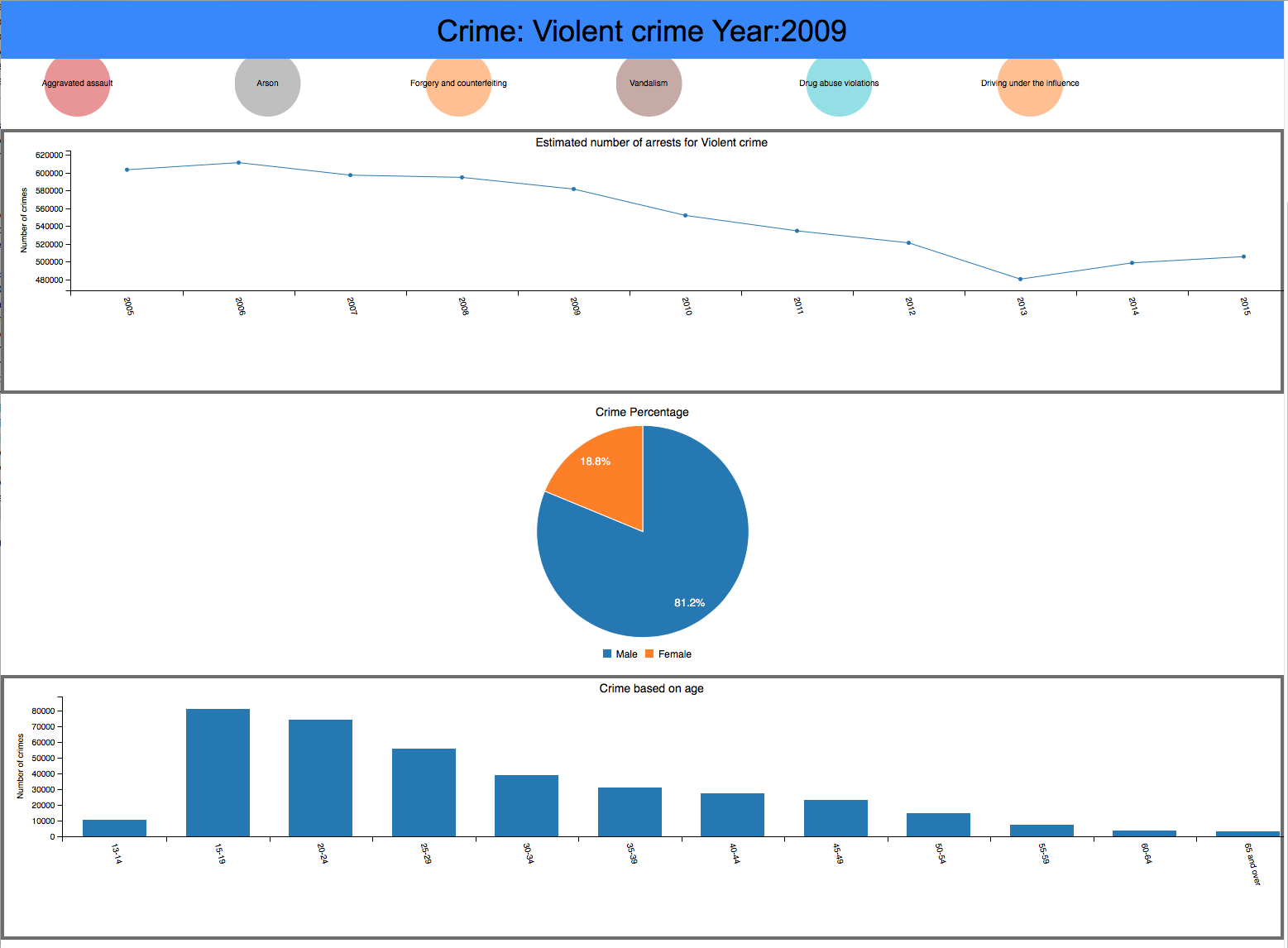 | In today’s society, crime has become the new normal on most news media. A lot of crimes are unknown to society and we tend to label everything as just another crime. This paper has the intention of abstracting the different types of crimes and educate the public on what has been the trend of the crime, which gender is most likely to commit such a crime, and what age group is this crime most likely to happen at. |
Summer Olympics 1896-2008 (Dutt) | demo video
 | The aim of this project is to visualize some aspects of Summer Olympics games from a period of over 100 years i.e. from 1896 to 2008. It is one of the most important and widely watched international event across the globe. They are organized every four years with some exceptions that are discovered by the visualization. I gathered the data generated and posted by the Olympics Committee from various sources and created an interactive visualization covering aspects such as participation and medals won. |
Rio 2016 (Sindhuja, Monica) | demo video
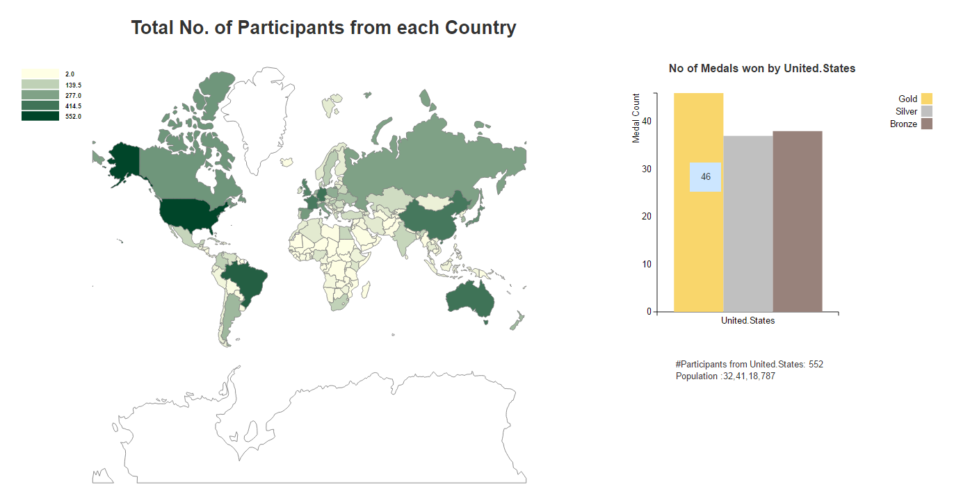 | Information can be best represented in a visual for people to understand what is the data about and what questions can be answered with the information (i.e. data) we have. Here in this paper, our objective is to visualize the information of Rio 2016 Olympics held in Brazil. Our main aim is to represent the data in different visualizations which helps people to understand the information and answer questions like what all countries participated, what is the total number of participants, how many people from each country won gold, silver, or bronze medals, what is female male ratio from each country or sport. These are the general questions which arise when we look at Olympics statistics. Who won which match can be found by following the Olympics. In this paper, we try to answer few questions which cannot be answered even by following the Olympics. |
Foreign Travel and Immigration to the US (Hind, Bathsheba)
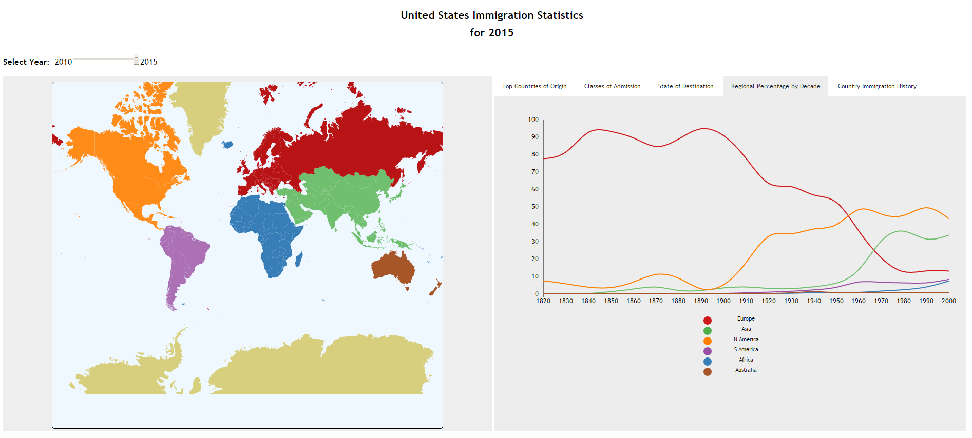 | In January 2017, a United States (US) executive order barred immigrants and foreign travelers from seven countries. The order sent shockwaves around the world and sparked numerous discussions surrounding US immigration, including concerns about origin and number of immigrants entering the country.Those that sought more information on immigration would often find visualizations that provided only one view of the data, lacked the desired level of detail or were not interactive. As a result, a visualization is developed that utilizes an interactive world map alongside a tabbed panel with various idioms to provide quick access to multiple views of immigration information.A bar chart, line chart, choropleth map and text lists provide quick access to the total number of immigrants from each region, country and class of admission as well as the totals that settle in each state in the US. |
Find My Car (Kumara, Rohila) | demo video
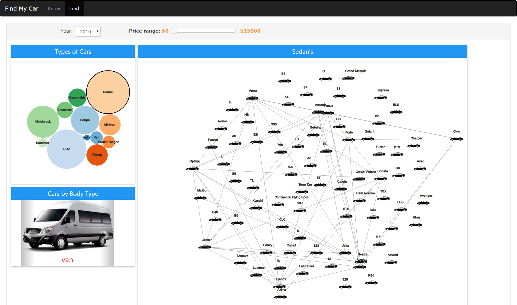 | The goal of this project is to show different models of cars available in the US market. It is designed for users who ant to buy a new car and are confused with different models available in the market. This is done by taking basic inputs from the user like price range, make year of the car and display models available in the market. Users can also compare several eatures that are available with different models. The system is designed to analyze sales of different brands of the cars and also safety rating and recall for each and every model of cars. |
Visualization of Global Military Power (Rohit, Sai Sathwick) | demo video
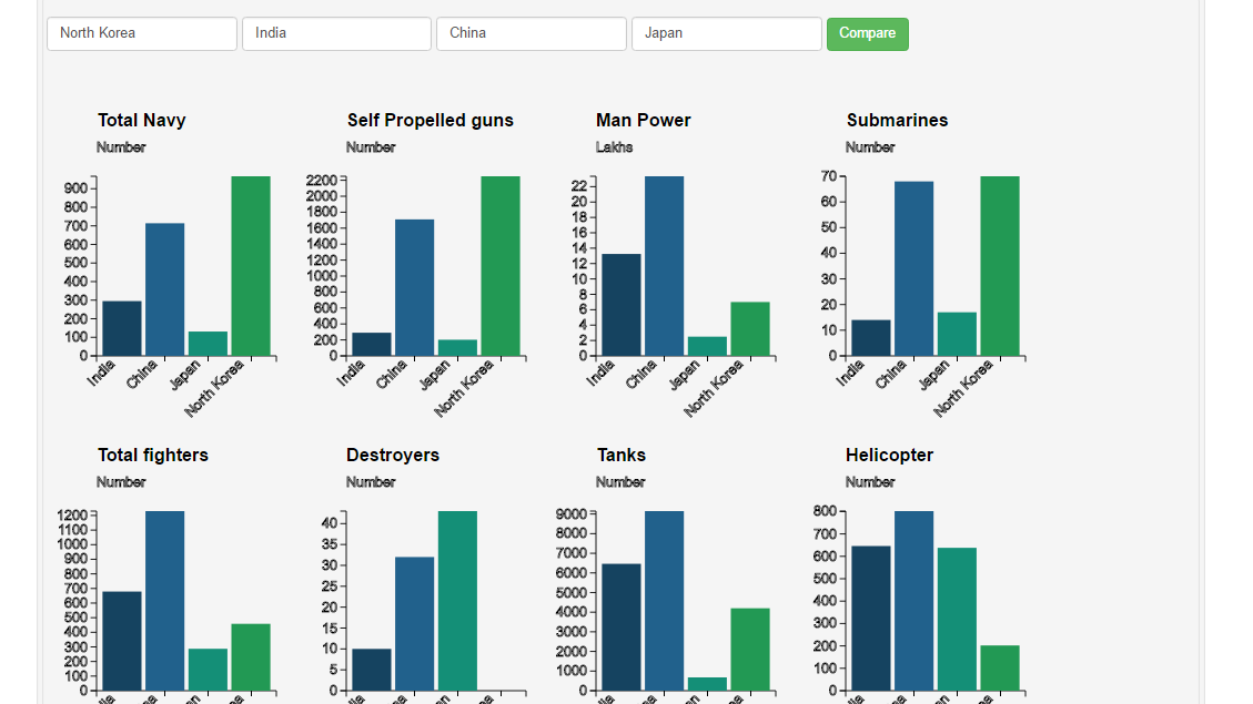 | Our project visualizes the military strength of different countries around the world. We focus on the vital aspects in the field of military and visualize them. The aim is to visualize significant military fields and their arsenals. We provide the user a platform to explore the statistics of a country through effective visualizations. Our project also focuses on the strengths and vulnerabilities of each country. A rank is given to every country based on their overall potential. Several salient features and the capabilities of a country can be assessed. |
IPL-Indian Premier League (Karan, Varun) | demo video
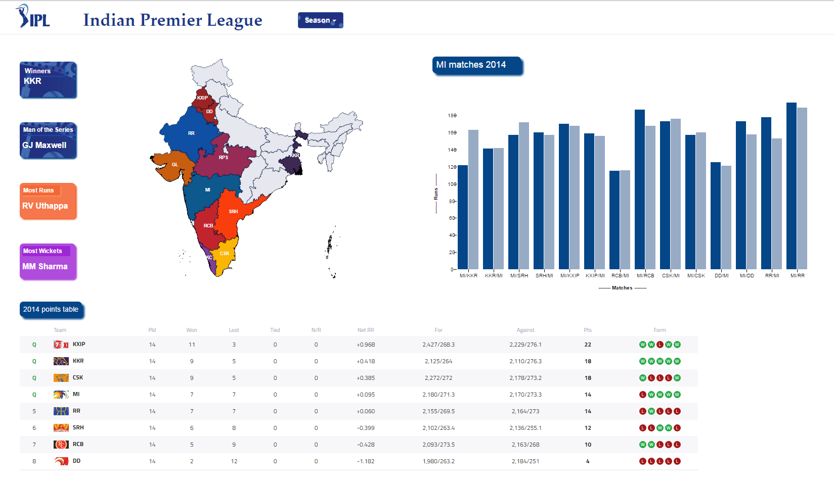 | In this project we have visualized the statistics of Indian Premier League for all the 9 seasons. It is concentrated on displaying complete information from a season to each ball in every match. The goal is to present statistics on the attributes - season, team and match. A user is provided with performance rankings, points table for each season and total scores of each match in a season. Upon comparing total runs in all matches played by a team in a season, user can navigate to run-rate, loss of wickets, types of runs, batting/bowling stands in the selected match. |
World Cup Statistic Visualization 1930-2014 (Huan, Tarek)
 | In this project we will design and create a web page that will host several interactive graphs that will effectively present some statistic information about FIFA World Cup from the tournament of 1930, the oldest tournament, to the latest tournament, which is the tournament of 2014. The goal of this project is to apply the effective methods to communicate data through the correct idioms, and use the proper design in each idiom to deliver the information clearly. The visualizations will be implemented by D3 visulization tool. |
Visualizing the Movie Trends in the Recent Past (Nandith, Sukesh) | demo video
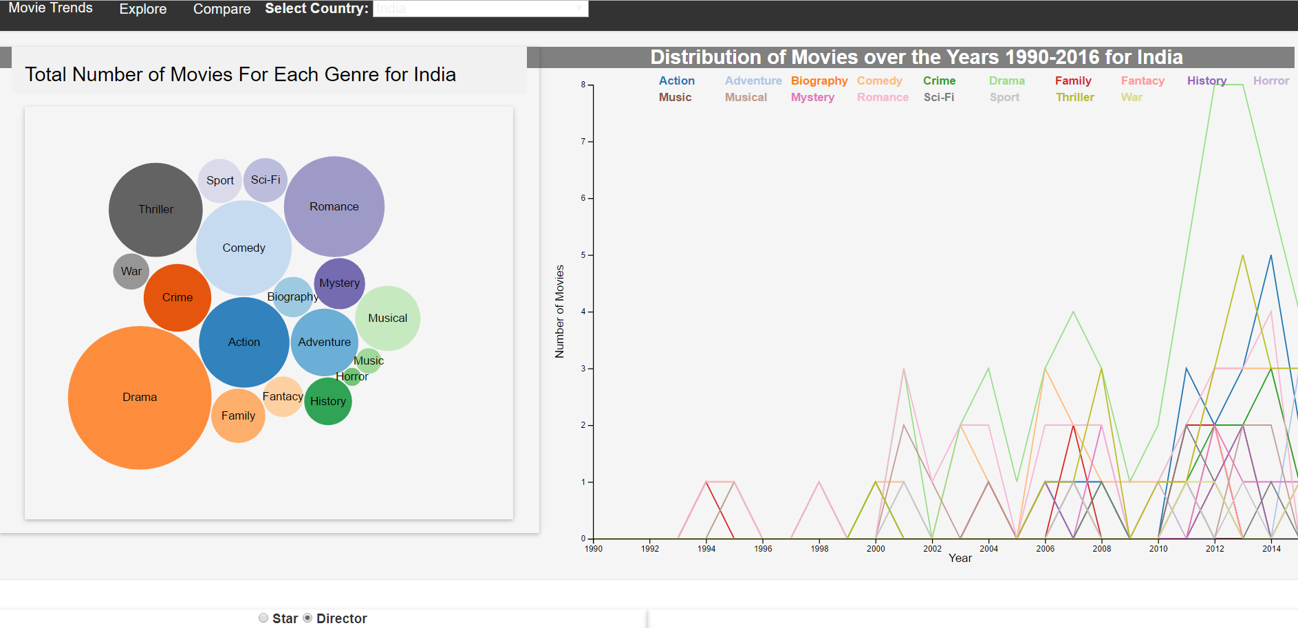 | We present the visualization and analysis of the movies that have the total user votes more than 25,000. The data set for the movies are collected from the IMDB website by running the python script. A total of 22,000 movies are visualized and an analysis is made on the results obtained. Simple interactive system is developed for the user to make analysis between various movies. The statistics for different movie attributes are obtained and visualization of data is performed. Major insights are discussed. |
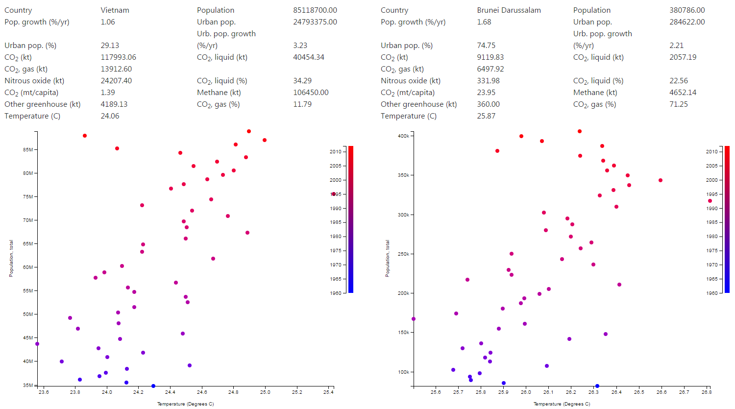
World's Children Health Data Visualization (Aida, Prajakta)
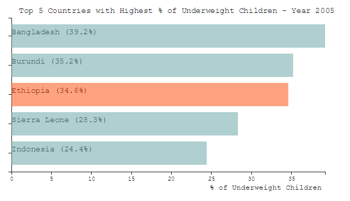 | In this project we present an interactive tool for visualizing datasets related to world’s children health, for different ountries in the world, over the different years using choropleth map and other types of charts, such as scatterplot, line chart and bar chart. In the recent years, there has been an increased focus on issues that affect children’s health. Most of these issues require unique solutions, which can be found by studying and observing different economic, environmental and health factors. Interactive visualization tools help researcher to better investigate and analyze the different aspects of the available datasets and conduct comparative studies to understand and recognize patterns and find the reasons behind children’s health issues. The datasets that we have selected for this visualization tool are percentage of underweight, overweight and stunted children in different countries in the world, over different years, along with GDP and percentage of the undernourished population. We intended to find patterns between the economic factors and the health factors of the world’s children population. |