CS 725/825 Information Visualization, Spring 2018
Spring 2018 was a bit different because I did not assign a semester project, but rather a 3-week homework assignment. Students picked a question to investigate and implemented their visualizations in D3. There are no demo videos as students just did an informal demo during our last class meeting. (The time taken by project demo day was used for a final exam.)
Are hate crimes on the rise in the United States? (Brian)
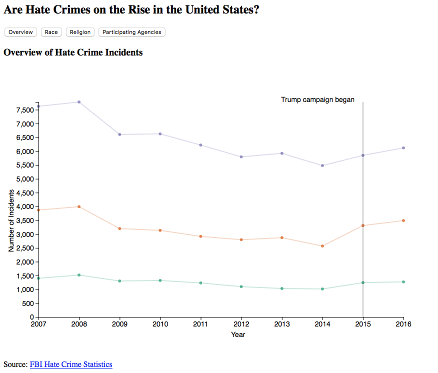 | The fight for equality covers many broad categories: race, religion, gender, sexual orientation, etc. I wanted to take a look at hate crimes targeted towards these groups of people and see how the trends have changed over the past 10 years. More specifically, I wanted to see if there was a correlation between the timing of the 2016 election and any changes in those trends. |
What factors influence the flu death rate in the U.S.? (David)
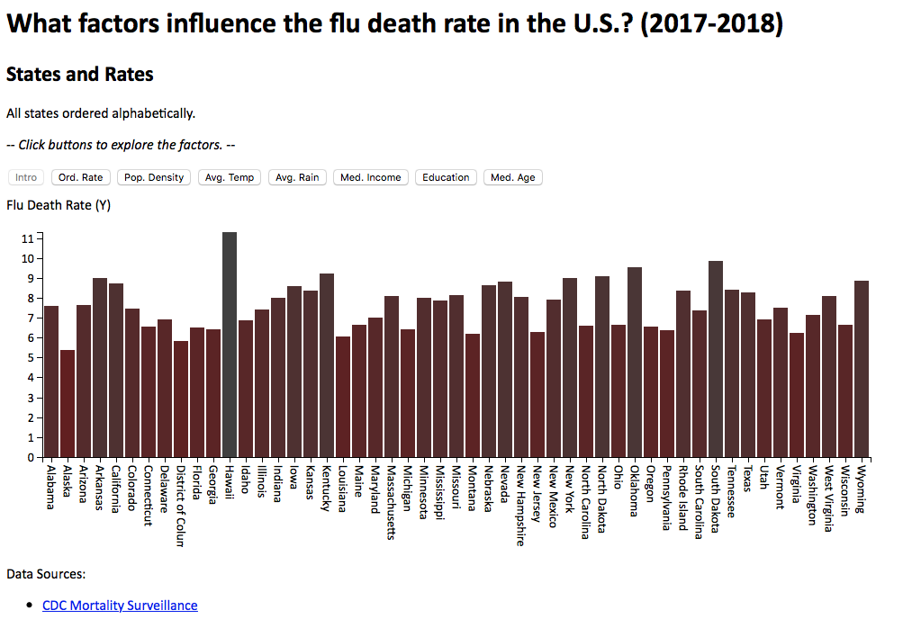 | Every fall a new flu season starts. It is often the subject of numerous news stories. Headlines screaming "Worst Flu Outbreak" or "Ineffective Flu Vaccine" or even "Flu-related Deaths on the Rise" are not uncommon any given flu season. I wanted to see if I could determine any factors that may influence the "Flu Death Rate." I investigated "What factors influence the flu death rate in the U.S.?" I look at the question regarding education level and impact, along with other factors. |
How many people have immigrated to the United States since World War II? (Udo)
 | The United States has always been a country of immigrants from its inception. There are policies and events that affect immigration positively and negatively. The present administration seems not to be very comfortable with the nation being open to everyone. The effect of the ongoing policy regarding DACA, students being deprived of in-state tuition in some states in the US, parents being threatened to be deported back to their home country, putting students in a precarious situation where they will have to decide to leave with their parents or stay back in the US motivated this question. I wanted to look at the number of immigrants in the United States after World War II and why some of these policies are under review. |
Has NYC become safer over last 10 years? (Shwetha)
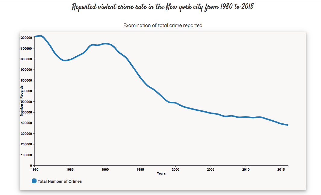 | Violent crime in New York City has been dropping since the mid-1990s and, as of 2015, is among the lowest of major cities in the United States. Crime rates spiked in the 1980s and early 1990s as the crack epidemic hit the city. According to a 2015 ranking of 50 cities by The Economist, New York was the 10th safest major city in the world, as well as the 28th safest in personal safety. During the 1990s, the New York City Police Department (NYPD) adopted CompStat, broken windows policing, and other strategies in a major effort to reduce crime. |
Can we identify correlation between having access to basic drinking water and sanitation, and mortality for children under 5 years caused by diarrhoeal diseases in South American countries? (Eric)
 | Water is essential to human survival. Having access to water is nice, but having access to clean water is better. Without clean water, the opportunity for diseases and infection increases. Most importantly, children growing up should have access to clean water because their immune system is still developing. When there is no access to clean drinking water or sanitation, diarrhoeal diseases is the most common killer among children. According to UNICEF, in 2016, diarrhoeal diseases was the cause of approximately 8% of all deaths among children under 5. |
Does a great defense make a superbowl winning quarterback appear greater then they are? (Jamie)
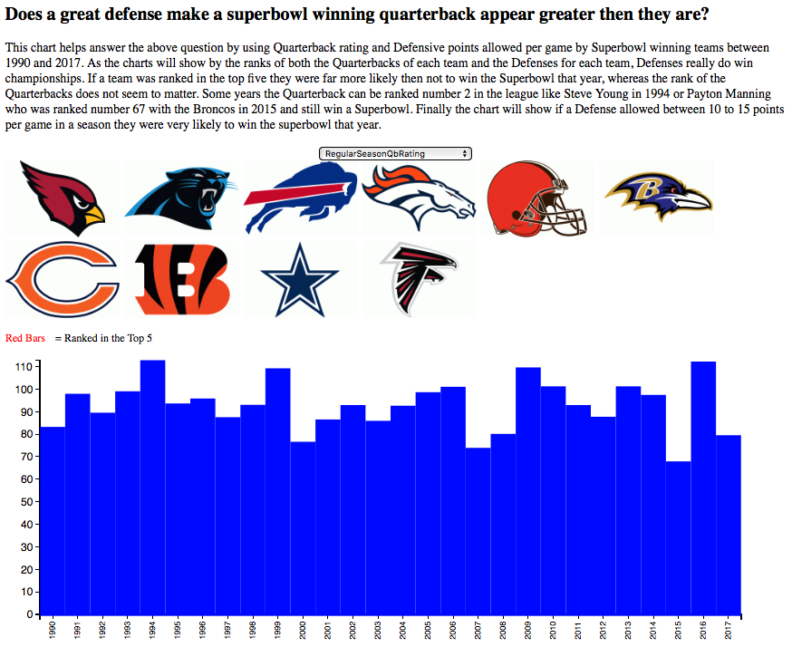 | I played football in college and I found that quarterbacks got way more credit for their teams successes then was due to them. For example, I played in college with a quarterback who once set an NCAA record for interceptions in a game (9) yet we won the game by 30 points due to great defense and a good running game. Since I am more of a fan of Pro football now, and watch the NFL quite often, I decided to focus my visualization more on Pro football than College football. |
How have police's fatal and non-fatal shooting levels changed from 2010 to 2016 in the 50 largest local police departments in the US? (Hussam)
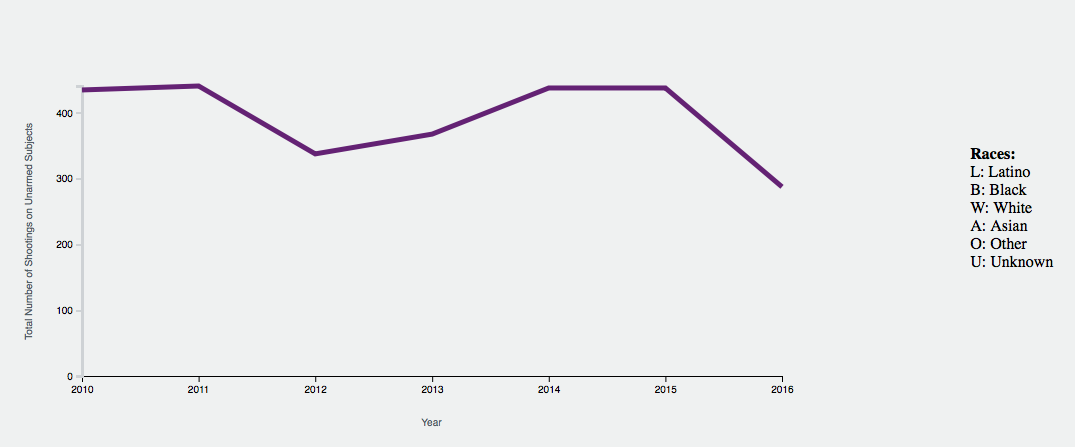 | This interactive line chart answers the question because the user can see the percentage of subjects from each race for each year as well as the total number of shootings on unarmed subjects. If the total goes down, that is an indication of effective training to a certain extent because it could be just less crimes for that year, but it can be an indication for overall training effectiveness because it is showing the the total number of shootings on unarmed subjects. This element in the design, which visualizes information from the derive data, is a strong indication of poor/effective training. It also breaks it down by race. |
Are critic ratings more important than user ratings? (Travis)
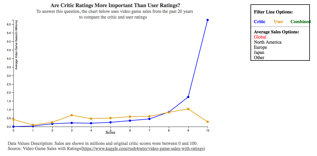 | The motivation for creating this visualization is to see if there was a big difference in how users rate video games vs critics and to see whether critics ratings are a good indication of how well a game will do. I show a comparison between the two and see if changing the category of sales will affect the trends. |
How does the toss impact the outcome of the match in IPL cricket? (Hariharan)
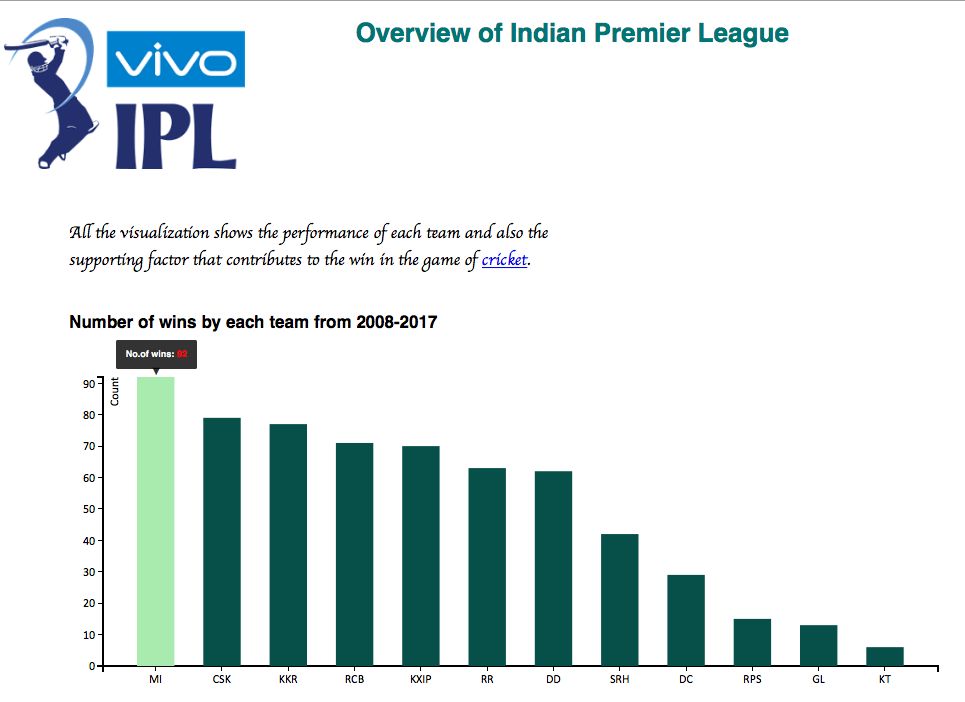 | The topic I chose for visualization is to show the overview of teams performance and the supporting factor in Indian Premier League (IPL) cricket. Being an ardent fan of cricket, I wanted to find interesting factors about the teams performance and how it supports in winning a match. At the end, I decided to check number of wins by each team over the years which further urge me to check teamwise winning record against all the other teams. Since winning is not only about the performance of players in a team there is an another underlying and important factor which is toss. I also decided to check if the toss is impacting the outcome of the match. |
What do I need to make a good movie? (Yash)
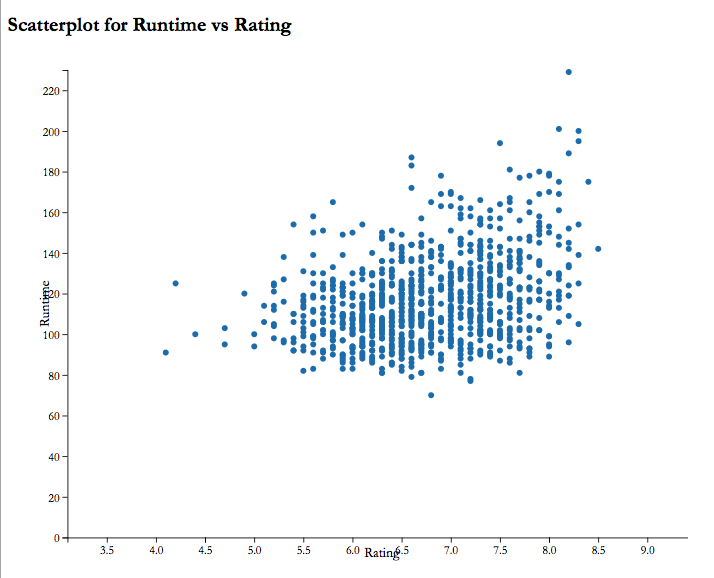 | I decided that I would consider highly rated movies as good movies. However, I didn't want to ignore the fact a movie also needs to recover its budget and make profits. I decided to go with scatterplots for most of the observations. As I had a reasonably big dataset, I wanted to know in which category most of my observations fit into and a scatterplot was perfect for what I needed. |
Which are the most popular category of trending videos from different countries? (Varsha)
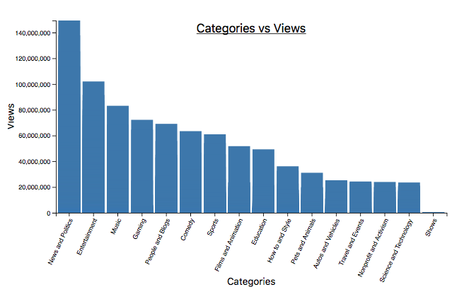 | YouTube maintains a list of the top trending videos on the platform based on various factors. The most important factor is user interaction, which is the number of views, likes, disliked and the comments that each video has gotten. These graphs are designed from the dataset which is a daily record of the top trending YouTube videos. It includes several months of data on the daily trending YouTube videos in the top 5 countries, which are United States, United Kingdom, Canada, Germany, and France. |
How do fatal shootings differ from non-fatal ones over the years considering armed status of subject? (Vaibhav)
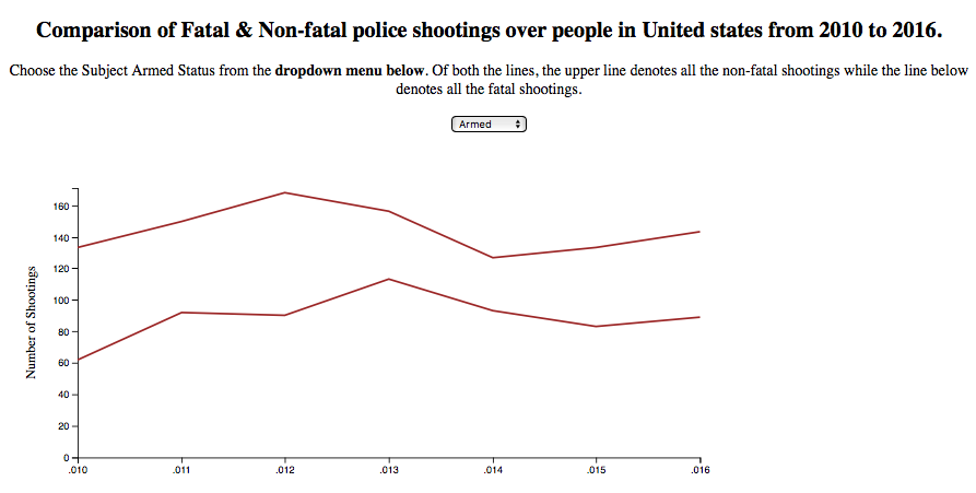 | There has been lots of news about police misconduct in some recent years which makes me wonder if it really a problem or just some individual cases. Then, I read this article in The Washington Post which says that it is compiling a database of every fatal shooting in the United States by a police officer in the line of duty since Jan. 1, 2015. Also, I read a story on Vice News where they had done an investigation which reveals that police shoot far more people than anyone realized, and they had spent months on collecting data on both fatal and nonfatal police shootings from the 50 largest local police departments in the United States. |
What are the favorable conditions to obtain a H1-B visa? (Kavyashree)
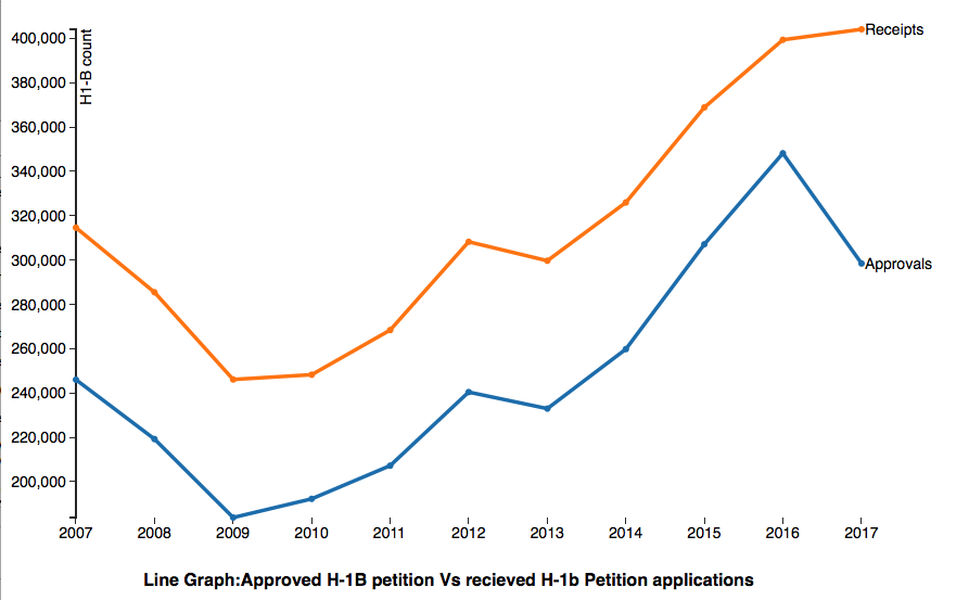 | The H-1B is an employment-based, non-immigrant visa category for temporary foreign workers in the United States. For a foreign national to apply for H1-B visa, an US employer must offer a job and petition for H-1B visa with the US immigration department. The main motivation behind considering this dataset is to let international students know the statistics of H-1B visas for a particular Industry and particular job type. Following the recent US Presidential Election, there has been a lot of chaos in the US about the H1-B visas and skilled immigrants, this was also a contributing factor in making us think about this dataset. |
CS 725/825 Information Visualization, Fall 2017
InfoVis Fall 2017 Class Projects @ WS-DL blog
Investigation Into Cryptocurrency Pricing Patterns With Respect to Financial Instability (Jason) | demo video
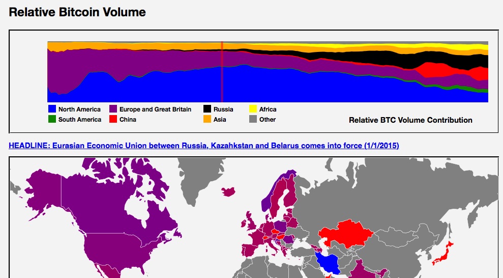 | Pricing patterns with respect to cryptocurrencies and their motivations have been the subject of heated debate among investment professionals and academicians alike. The purpose of this visualization is to provide a focused presentation of the world events conincident with spikes in peer-to-peer cryptocurrency transactions together with a continuous evolutionary timeline to provide perspective regarding the state of development and usage at a national, regional and worldwide level. As a matter of practical concern, Bitcoin was the sole cryptocurrency used in this analysis due to the large amount of country specific peer-to-peer data available, as well as the relatively simple purpose for which it is intended - namely, the transfer of monetary value from one individual to another. |
World Leader Interactions on Social Media (Twitter) (Grant) | demo video
 | Social media has become a platform that world leaders have begun to use to express their voice to the public. Twitter in particular,is interacted with frequently with data open to users publicly which allows for developers to take this data and visualize it for each user. Many visualizations have been created using Twitter data before and Twitter itself offers an analytics dashboard for users to explore. This however is limited as it represents single user not Twitter lists.To alleviate this problem, an interactive dashboard was built to visualize ways a twitter lists data can be used and represented in different ways. For this visualization we used the World Leaders list on twitter, with the addition of a few world leaders not on the list, to derive information and visualize shared information among these users. The goal of this visualization is to show shared term usage among world leaders, see which times tweets are more likely to be sent out, the sentiment of the users, and the decay of data allocated in a static decreasing time interval. |
Holiday Flight Patterns (Asmita) | demo video
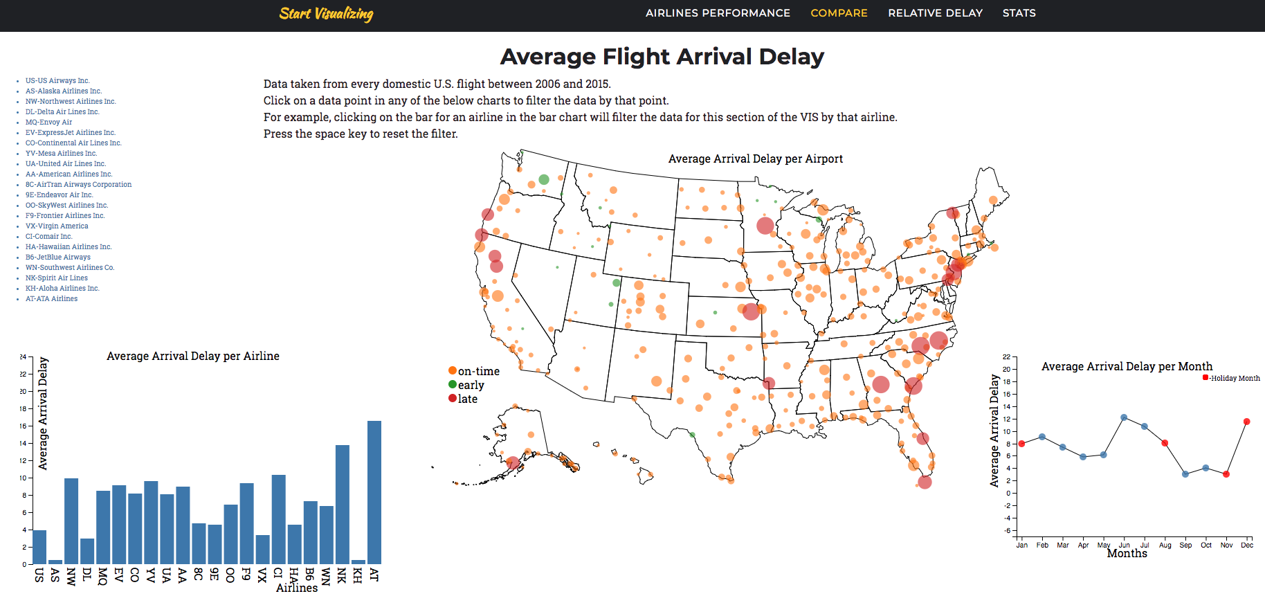 | In this paper, I present an interactive tool for visualizing holiday flight patterns using dot chart to visualize the last years data, US map with bubble on it to displaying the average arrival delay of a particular airport with the airlines and a line chart which shows the month distribution from the year 2006 to 2015 and US Map with bubbles to show the relative delay of different time periods. In the recent years, there has been an increased focus on the flight being delayed more on holidays. Interactive visualization tools help the researcher to better investigate and analyze the different aspects of the available datasets and conduct comparative studies to understand and recognize patterns of delay during the holiday and non-holiday months. The datasets that I have selected for this visualization tool are the percentage of on-time arrival, delayed and cancellations in different airlines operating in the US, over different years. I intended to find patterns between holiday and non-holiday months of flights. |
Sports Injuries (Plinio, Miranda) | demo video
 | Personnel is the most important asset of any organization. Employee absenteeism can impact the overall ability of any enterprise to operate smoothly, especially if a great deal of its personnel is absent due to injuries. Visualization idioms could be employed to gather the data already available to a particular organization and to help the decision makers take proper actions to solve or mitigate a given problem. The visualization presented in this paper deals with an organization interested in reducing the number of personnel injuries due to the dangerous nature of their job, and looks into a more effective visualization technique that measures its physical performance training program. The goal of the visualization project, presented in this paper, is to provide answers specific to the organization in terms of identifying where most injuries occur, which activities are injury-prone, correlation of injuries with the training program, and the evaluation and trends of its members physical training performance. |
Federal Workforce (John)
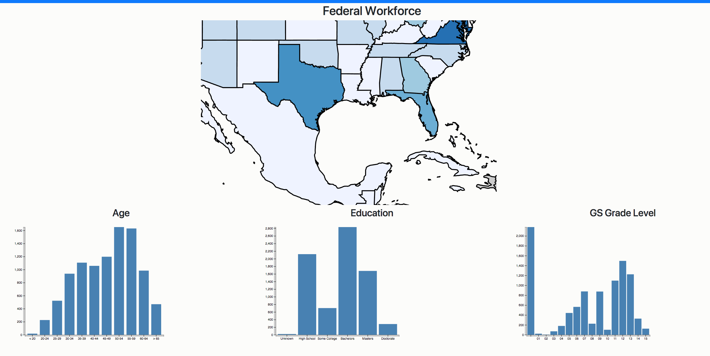 | This paper presents the motivation of the deisgn that went into making this VIZ. The user is able to peek into some of the characteristics that make up the current Federal civil service workforce. The VIZ also provides a visual snapshot of how widely dispersed the workforce is as well. |
>Meteorite Landings (Pratik, KK)
 | This work aims to visualize the meteorite landings on Earth based on their fall type - fell (meteorites that were witnessed during their fall) and found (meteorites that are discovered many years later). We first show the correlation between meteorite falls and world population distribution by providing an interactive world population choropleth map with all meteorite landing sites. Through an interactive line chart, a viewer can track the number of meteorites landings over the years. Cross-filtered bar and pie charts represent the number of meteorite landings and their proportion by fall type for each country. |
Nutritional Facts (Girish and Mohamed) | demo video
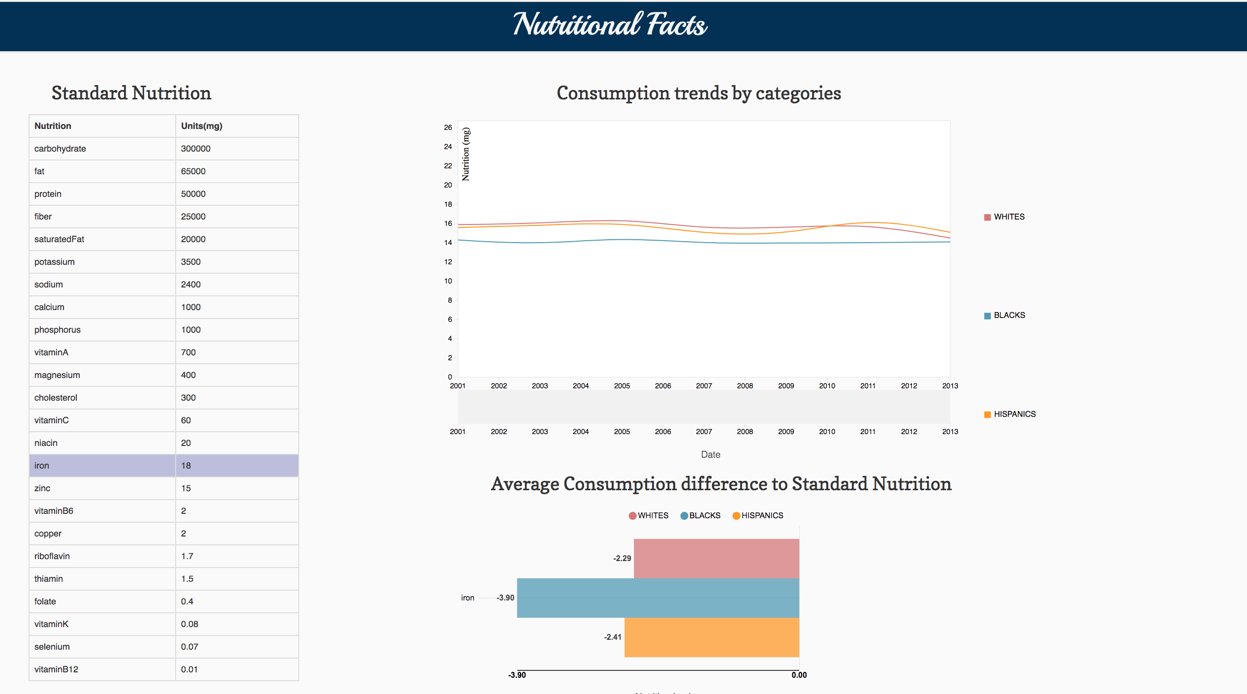 | Daily nutrition is a definite measure for everyone to compare the levels of nutrition intake. Amidst comparison to the daily standard values there are certain nutrients which become deficient based on the food intake. Taking this into consideration, we developed a web-based visualization which is likely to show the standards and intake measures over the years by considering three different races. Substantially, we also show the key differences in the intake levels of various nutrition�s and the deficiencies as well. Having analyzed and identified the understanding of deficient nutrition, it is quite important to overcome the deficiency. Thus, we also present sufficient information visually where proper nutrition can be formulated through consumption of fruits. The purpose of this project to understand the grey areas of nutrition standards and deficiencies. Also, derive a definite way to fill the nutritional gap. |
Global Warming and Its Implications on USA (Mehak, Nauman) | demo video
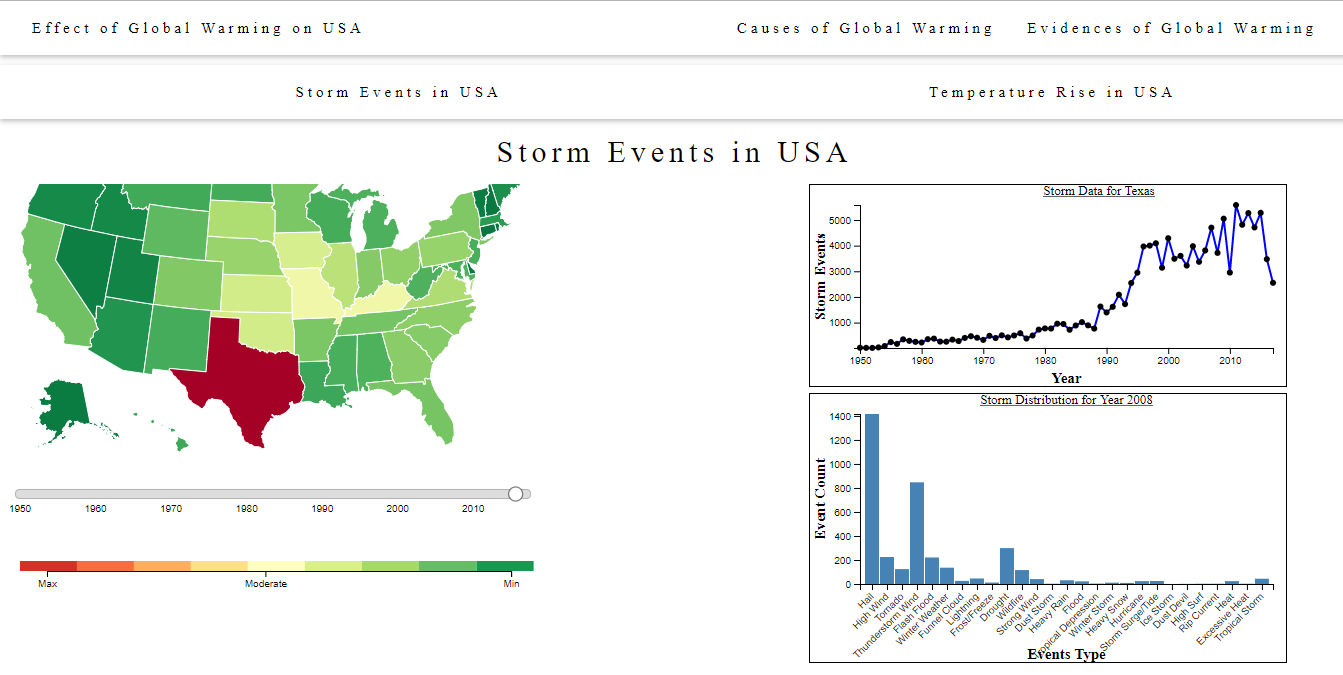 | The paper describes the visualization about effects of global warming on the USA while highlighting the causes and evidence of global warming worldwide. The evidence and causes of global warming have been discussed and visualized in detail by NASA but its effects have been discussed without any visualization. The purpose of the visualization is to use a discussion about the effects of the global warming and visualize it with respect to the USA to better understand the implications of global warming in our surroundings. The results about the effects of global warming on the USA show an alarming spike in the increase of storm events and temperature rise across the USA. |
GitHub Insights in Top Repositories (Srivanthi, Rahul) | demo video
 | This article presents a visualization interface to explore the GitHub data and find some interesting aspects how the usage of GitHub improved over the past few years. Our webpage gives the user the interactive interface which allows him to analyze data according to his selections. Most of the websites which already exist are showing the statistics in a table which are extracted by queries, which doesn�t give any chance for the user to interactively analyze. Different idioms like choropleth map, world map with data plotted, line chart and bar chart are used to effectively visualize the GitHub Archive dataset, which targets at providing a website for the users to help them explore and understand some interesting insights that may not be noticed easily by looking at the data. |
U.S. Chronic Disease Indicators (CDI) (Alaaeddine) | demo video
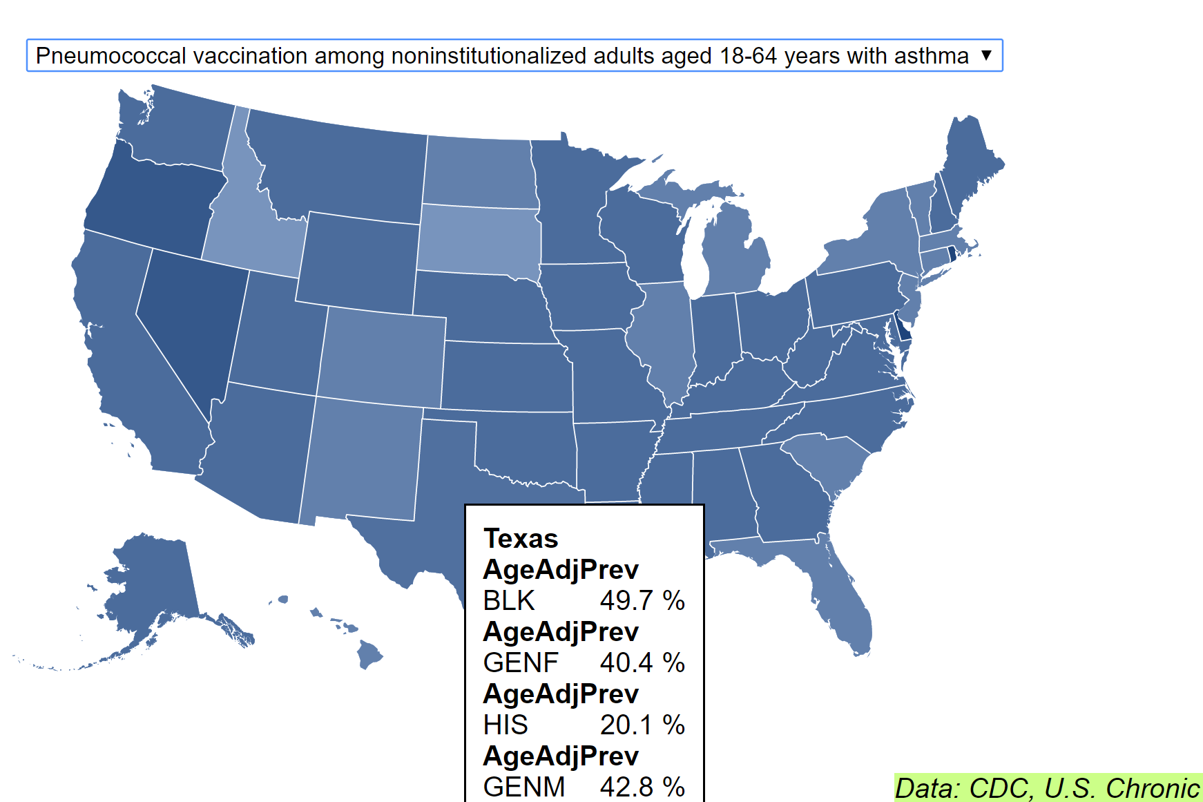 | The USA is a first-world country on the cutting edge of medical innovations. However, through all the advancements, the majority of deaths in the United States continues to be attributed to chronic diseases accounting for seventy percent of overall deaths annually. In efforts to identify useful information that could help discover key information related to the onset of these chronic diseases the Center For Disease Control (CDC) has created a set of surveillance indicators(CDI). These indicator have been carefully chosen because of their relation to chronic diseases. They are used to find correlations, and provide prioritization and evaluation of public health interventions. In this project I used the CDI and its corresponding categories of interest to arrange the data given by the CDC dataset into an interactive map system that is created on execution of the HTML. The code is implemented mostly in (Data-Driven Documents) D3, a Javascript library, and follows the logic outlined by the CDC in category organization: Year, Location, CDI, Category Surveyed, and Race/Gender. The end visualization created is more user friendly and localized than ones provided by the CDC. Once loaded, transitions between topics of interest are much smoother and relevant topic data is localized to a single visualization instead of being spread out onto different pages. Because this can create a convoluted view users have the choice to focus on particular states through the mouse-over tool allowing for a cleaner and more focused view. The program can also be used as a general purpose display tool for many CDC datasets as the data formatting is compatible with most dataset layouts. |
Debt Analysis Tool (Ioannis)
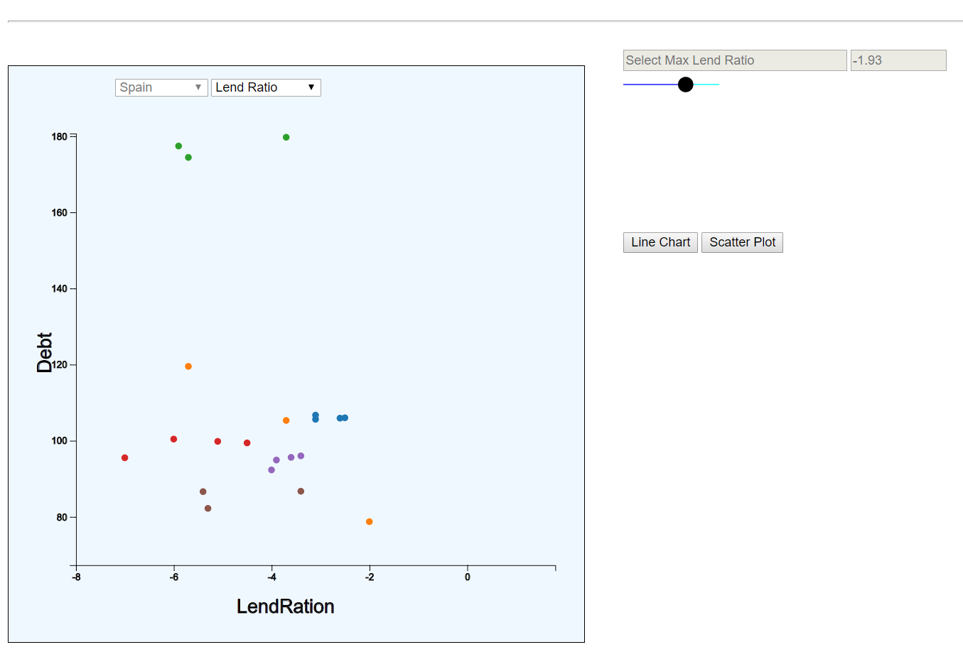 | In order to better understand how to potentially decrease debt, we have to know what causes it, what factors can help contain it and what factors have proved to have no impact. The Debt Analysis tool is an interactive visualization that allows users to manipulate graphs that uncover correlations between underlying factors of debt. It can be used to identify outliers, trends, and compare uncovered correlations. The interactivity eliminates the misleading nature of such graphs and allows the user to reach his own conclusions |
CS 725/825 Information Visualization, Spring 2017
There were 19 projects this semester, so these are split out on a separate page.
CS 725/825 Information Visualization, Spring 2016
InfoVis Spring 2016 Class Projects @ WS-DL blog
Visualization for Navy Hearing Conservation Program (HCP) (Hung, Srinivas, Erika) | demo video
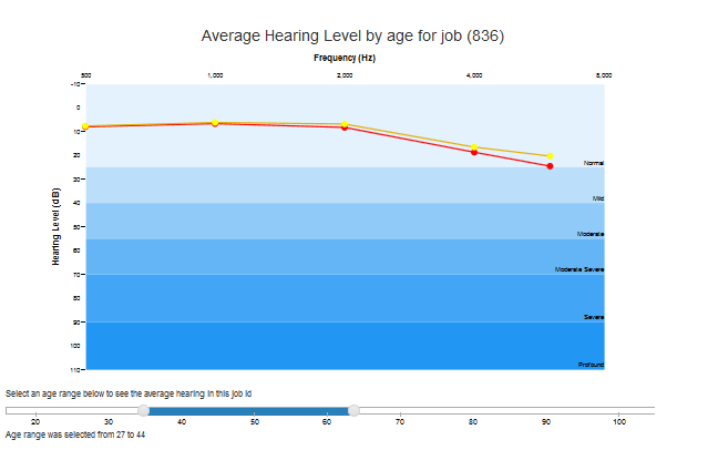 | The aim of this work is to track hearing level of workers in US navy over a period of time through Hearing Conservation Program (HCP). Hearing Conservation Program is an internal training conducted by the US Navy with a goal to detect and prevent a noise-induced hearing loss among the service members by analyzing their hearing levels over the years. The authors analyzed the data obtained from the Audiogram dataset to produce some interactive visualizations using D3.js to see hearing curves of workers over the years. |
Expanding the WorldVis Simulation (Juliette, Mridul, Christos) | demo video
 | In this work we present our modifications to the WorldVis, FluNet Visualization tool, a specialized tool for visualizing influenza outbreaks over weeks and years per country via an animated choropleth map. We extend this specialized tool to account for general datasets of quantitative attributes per country over time. We replace the difficult to interpret visualizations from the specialized tool with familiar line graphs that users will know how to read. We extend the functionality of the choropleth map to encode the attributes based on continent average. We also compute summary data for each dataset for each year, so at a glance, the user can see statistical information including the country with the minimum and maximum value. Our modifications focus on making the tool more general and on the visual encoding and interaction idiom. |
ODU Student Demographics (Ravi, Rajyalakshmi, Shivani) | demo video
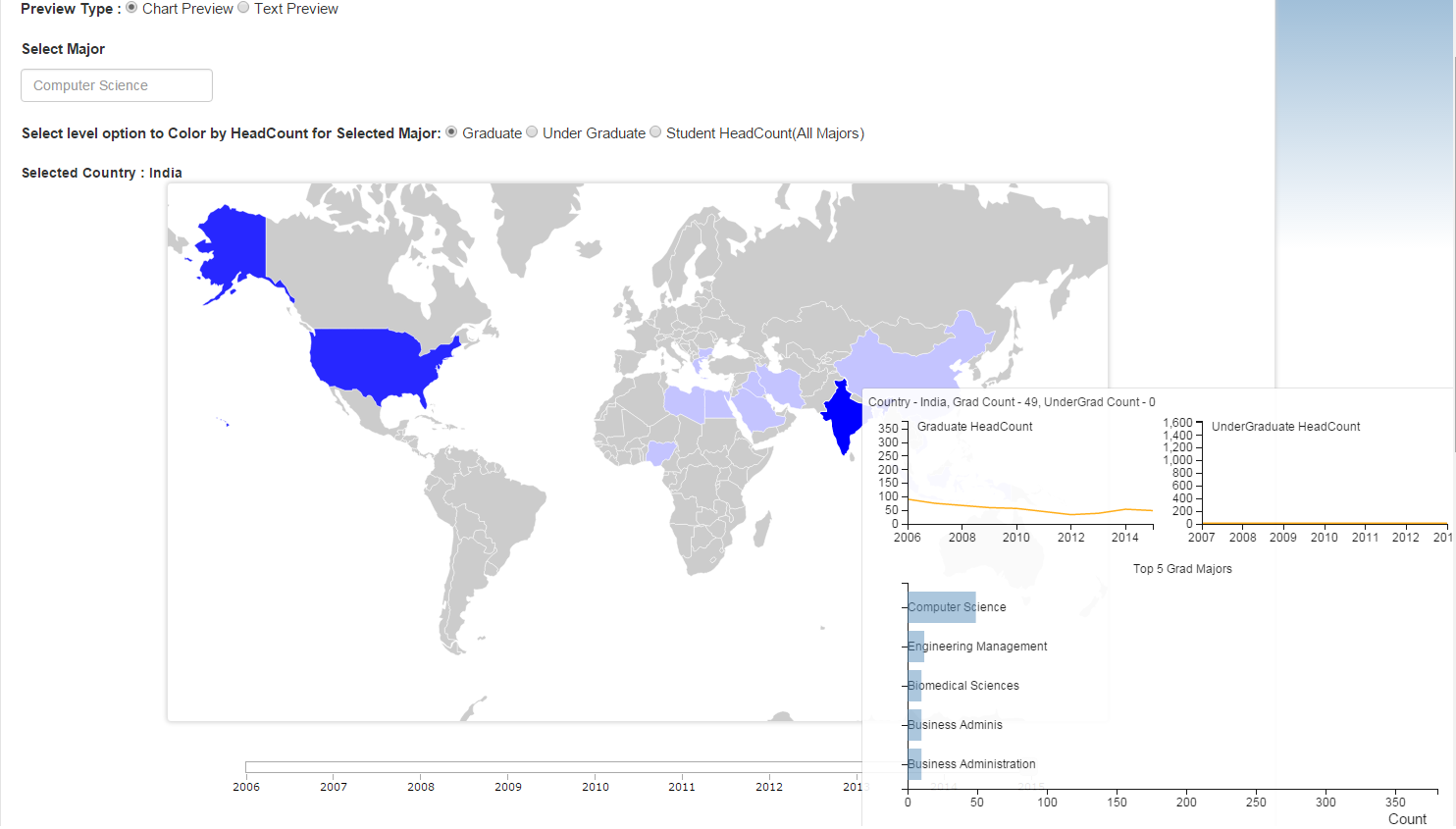 | This work concentrates on ODU international student information. It visualizes the headcount of International graduate and undergraduate students studying at ODU for each country for a particular major in a selected year and gender ratio for undergraduate and graduate students in the university for each year. The main goal is to provide an interactive interface for the prospective students, to analyze the global diversity at ODU and identify whether ODU best suits their expectations in the aspects of alumni from their respective major and country. |
Analysis of Student Fee Structure at ODU (Mounika Ko., Sindhuja, Keerti) | demo video
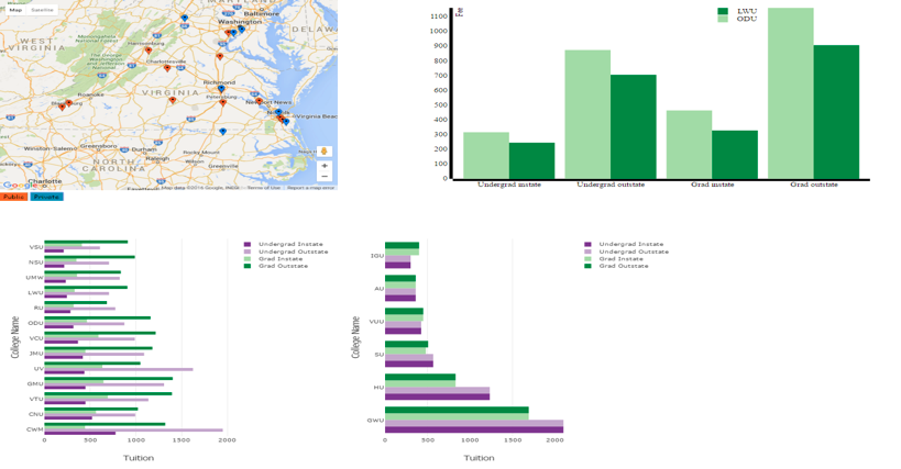 | This project aims at studying and comparing the ODU (Old Dominion University) tuition rates with other universities in Virginia. This project also focusses on understanding how much the tuition rates have increased over the years. Mandatory fees has become one of the growing concerns for students, This project studies and analyzes the reason for increase in mandatory fees and also identifies the divisions in mandatory fees. The tuition trends over the years 2004-2015 are identified and compared with the current tuition rates. |
Slate of Schools - US Universities (Dinesh, Rithika, Bhavani) | demo video
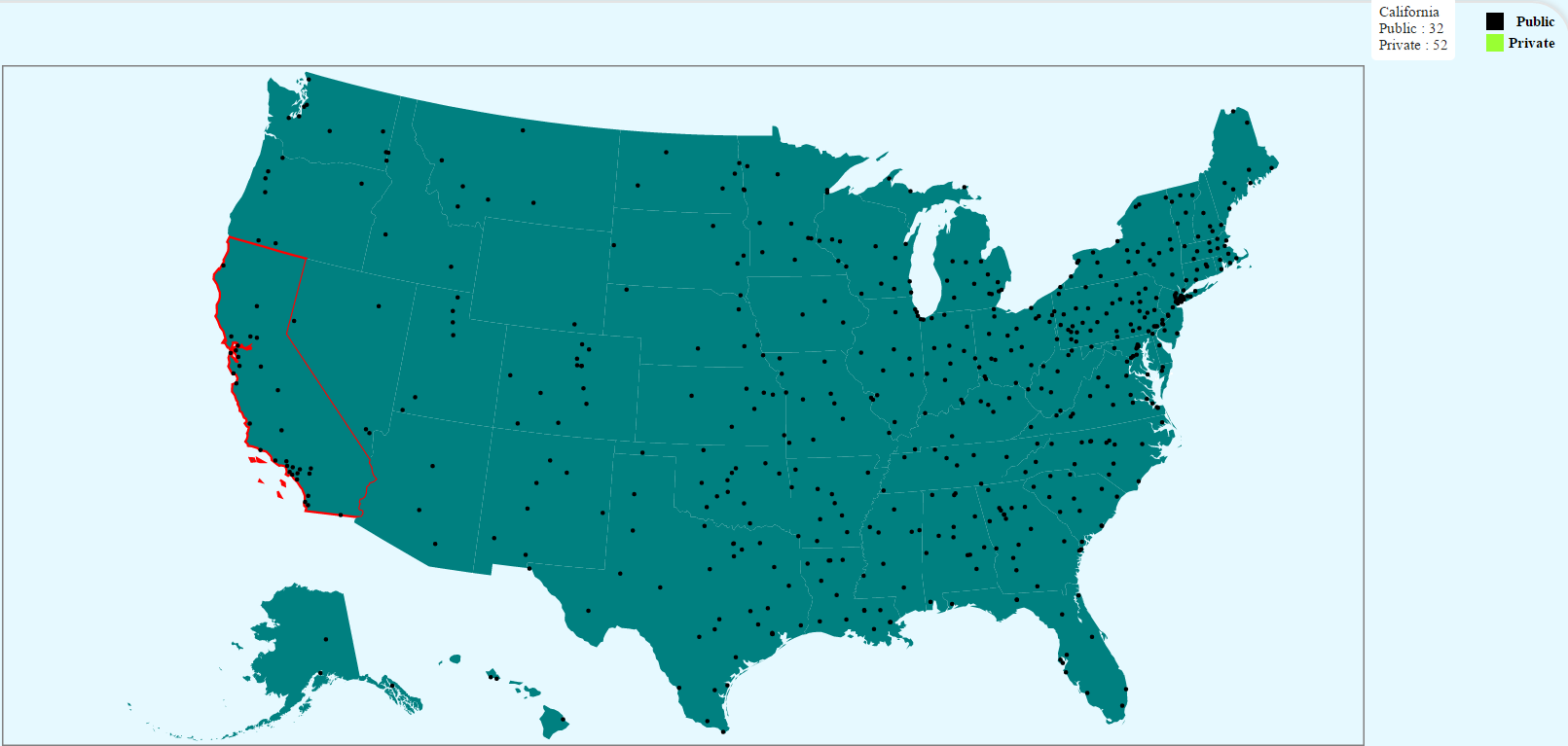 | In this project we have shown all the 4 or more year U.S Universities in one place mainly focusing on acceptance ratio and tuition fee. It is designed for those students who looks for a quality education and are confused. This is done by comparing statistics of the universities in and outside a state. Upon observation, it is noticed that universities with less acceptance rate is highly ranked compared to universities with high acceptance rate and also have relatively high tuition fees. |
A Current and Future Threat: Global Warming, Sea Level Rise, and Household Income (James, Manoj, Seyedmeysam) | demo video (WebEx)
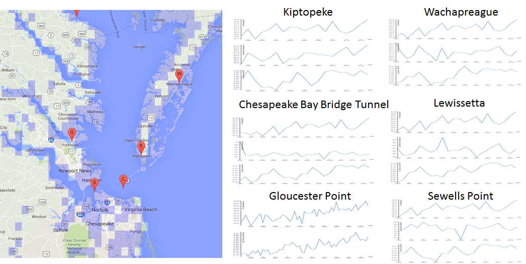 | This work seeks to highlight the impact of global climate change on the eastern seaboard of Virginia. We first consider the historical correlations between rising temperatures and rising sea level at seven data collection stations across the Tidewater region. We then visualize the effects of various projected amounts of sea level rise across the region. Finally, we consider the median household income in the areas likely to be affected by the projected amounts of sea level rise. It is not our intention to draw firm conclusions regarding the projected impact of climate change in this region, but instead to demonstrate measured historical trends and to visualize possible future impacts to the region. Two conclusions seem clear from the available data: 1) sea level rise is occurring along the Virginia coastline, and 2) households at all income levels are likely to be affected by a significant rise in sea level, not just the wealthy who own homes along the shore. |
Effects of Flooding on Real Estate in Hampton Roads (Lloyd, Evan)
 | For many who have lived in Norfolk, VA a seasonal storm or heavy rain is a normal occurrence that eventually results in flooding. A first time home buyer or an established investing firm located in San Diego may not be aware of this risk in Norfolk. A tool that allows buyers to evaluate the effects of flooding near their potential real estate investment or to evaluate the entire local real estate market would be very useful. By having this knowledge at their fingertips users would make better decisions and be more satisfied with the purchase knowing the flooding risk around the property. |
Visualizing Web Archives of Moderate Size (John, Joel, Dan) | demo video
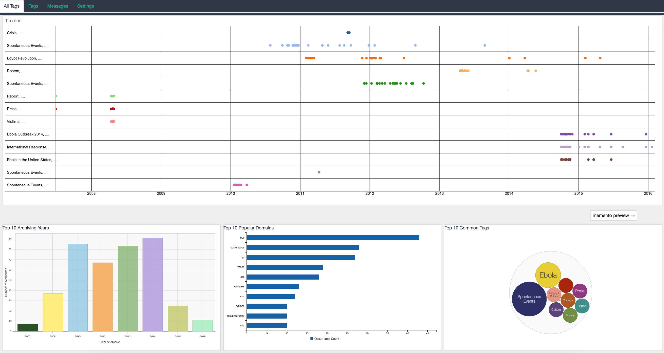 | For our research, we leverage this platform as a means of understanding web archives in a multi user setting. In this study, we propose a new approach towards identifying the general state of the archives, by using contextual data provided during the archival process. This meta data allows us to identify the most common domains, archived resources, times and tags associated with a web collection. We find this approach an adequate solution for multi user settings, where the designed tool outlines the most important areas of focus in web archives and gives users a more clear picture of what their collections comprise of, both in specific and general terms. |
Campus Safety and Security (Sumanth, Abhishek, Venkata) | demo video
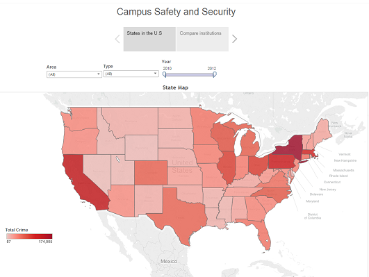 | The goal of this work is to show the crime rates in different universities across United States of America. Based on the crime rate, the system provides a user interactivbe view which projects the visualization for all the universities based on its total crime. The system is designed to analyze various aspects of the crimes committed. |
ODU Course Listing Visualization (Mounika Ka., Surbhi, Srineeja) | demo video
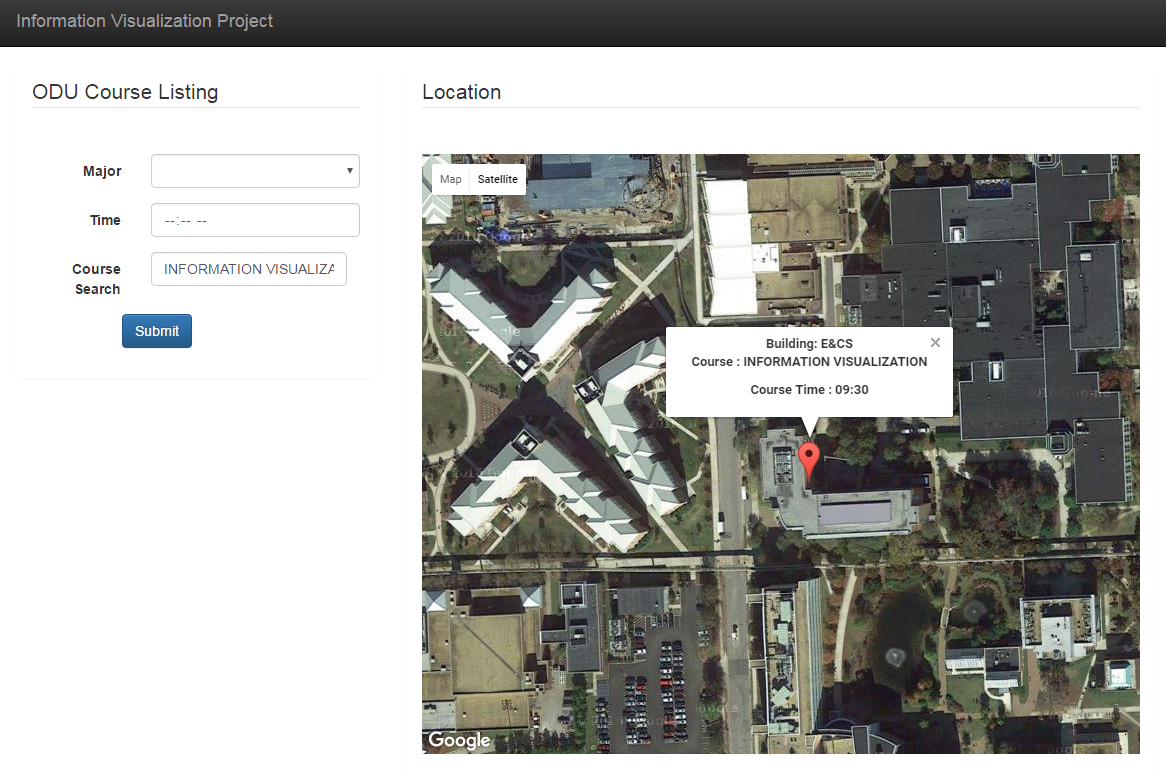 | In this work, we define a system that uses meaningful visualizations to help students and administrators in any University. In a huge University campus like ODU, there is a high chance of one losing their way while searching for their class, especially when they are new to the place. Our aim was to help such students to find where the classes are happening and easily find the location through Google Maps. This work is to analyze the course listing data from the University and implement the course search through Google map to make it easier for students. Also, there are other statistics about different buildings which hold many number of classes on a daily basis and statistics based on each department data. This information helps the University to analyze the strength of the courses offered. |
CS 725/825 Information Visualization, Spring 2015
InfoVis Spring 2015 Class Projects @ WS-DL blog
A Visualization for Exploration of the Chesapeake Bay Currents Dataset (Teresa) | demo video
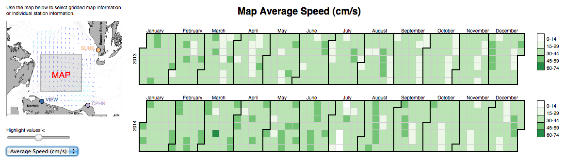 | The Chesapeake Bay Currents Dataset Exploration visualization tool was created to provide users with information about a high frequency radar surface currents dataset collected by Old Dominion University�s Center for Coastal Physical Oceanography (CCPO). The difficulty of obtaining publicly available metadata for high frequency (HF) radar data provided motivation for this project. |
Hampton Roads: In- & Out-Flow of DoD Contracting Dollars (Kayla and Swaraj) | demo video
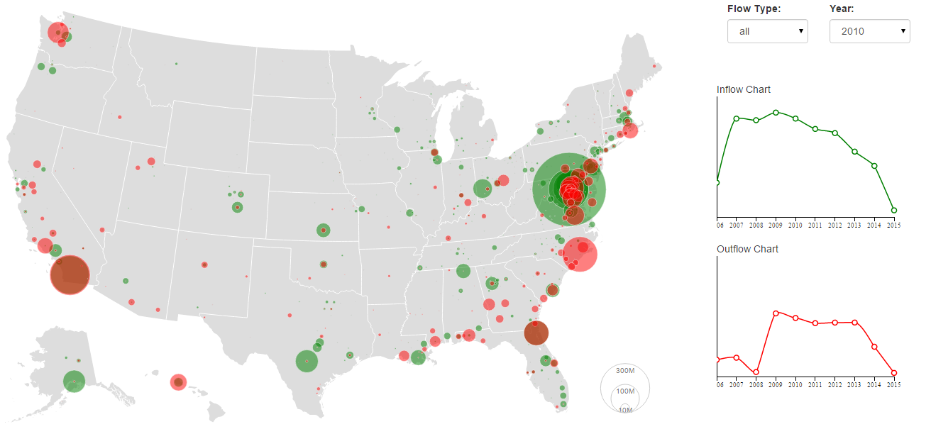 | Hampton Roads: In- & Out-Flow of DoD Contracting Dollars is a visualization for the flow of DoD contracting dollars to and from the Hampton Roads area of Virginia. The system is for those who wish to analyze how the in- and out-flow of DoD contracting dollars affects the Hampton Roads economy. We designed an interactive bubble map which shows the flow of DoD contracting dollars to and from Hampton Roads based on counties, along with line charts which show the total amount of inflow and outflow dollars, while hovering over a county on the map shows the inflow and outflow amounts for that county overtime. |
Federal Contracting in Hampton Roads (Shawn and Valentina) | demo video
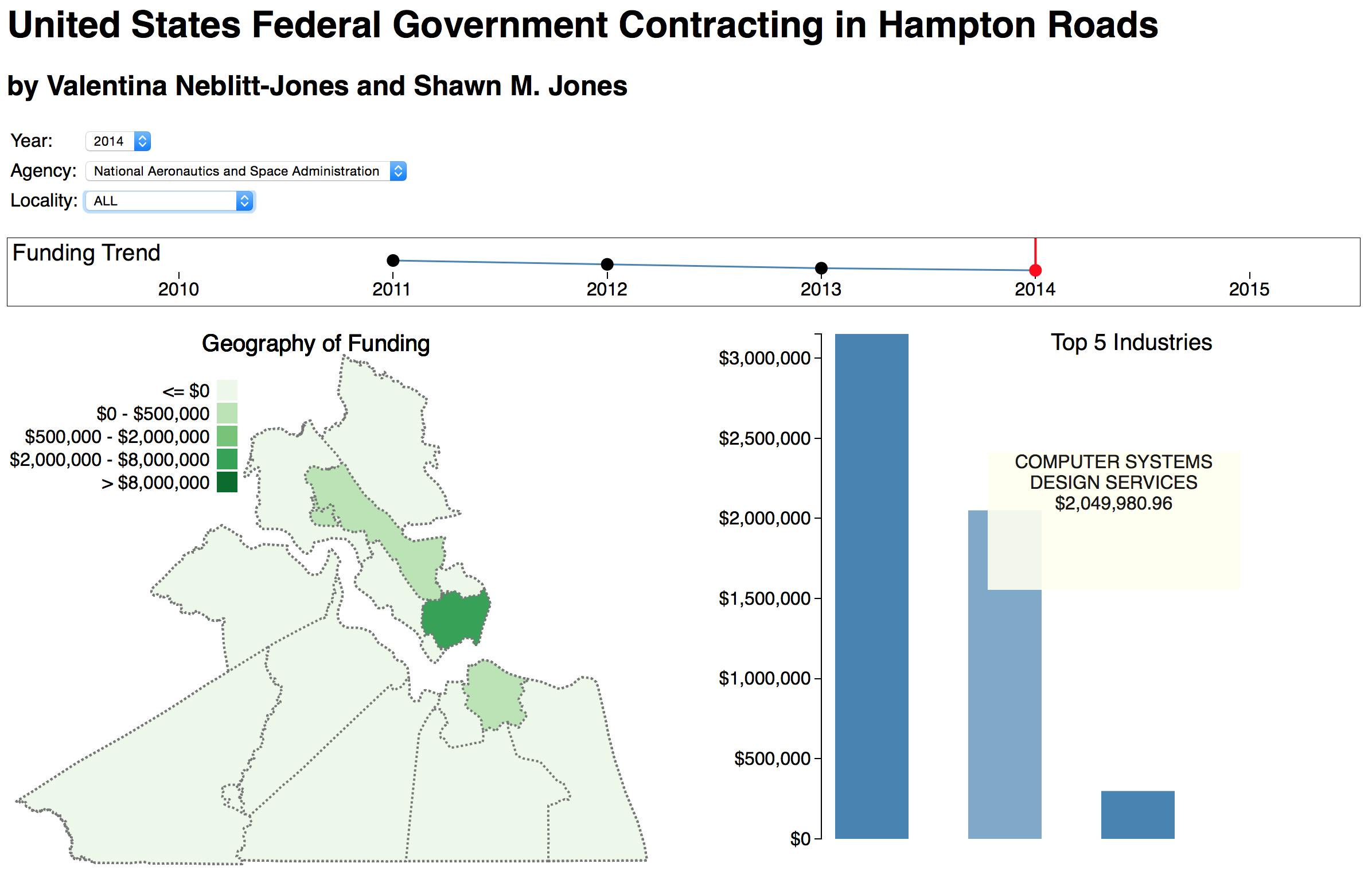 | We present a visualization for United States federal government contracting awards in the Hampton Roads region of the State of Virginia. Our visualization consists of a map (choropleth) displaying different colors based on the funding each locality receives. To the right of the map is a bar chart displaying a bar indicating how much funding each industry received. On top of the map and the bar chart is a small line chart (sparkline) showing the trend in funding. Our visualization allows the user to select a year, agency, or locality with the Hampton Roads area, updating the choropleth, bar chart, and sparkline as appropriate. |
Sea Level Rise and its Impact on Transportation Infrastructure (Apeksha and Raghav) This work was also featured in an online article by the ODU Mace & Crown - http://www.maceandcrown.com/2016/03/24/watch-norfolk-flood-3-dimensions/
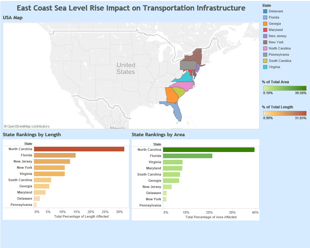 | The goal of this visualization is to show the sea level rise and its impact on transportation infrastructure along the east coast line of the United States of America. The transportation infrastructure includes interstates, minor-arterials, national highways, non-interstates, rails, airport properties and ports. Based on the impact, the system provides a user interactive view which projects the visualization for all the east coast states along with percentage of transportation infrastructure affected. The system is designed to analyze the total impact on each state and to provide a comparison among the states. |
Hypothes.is Annotations Analyzer (Wessam)
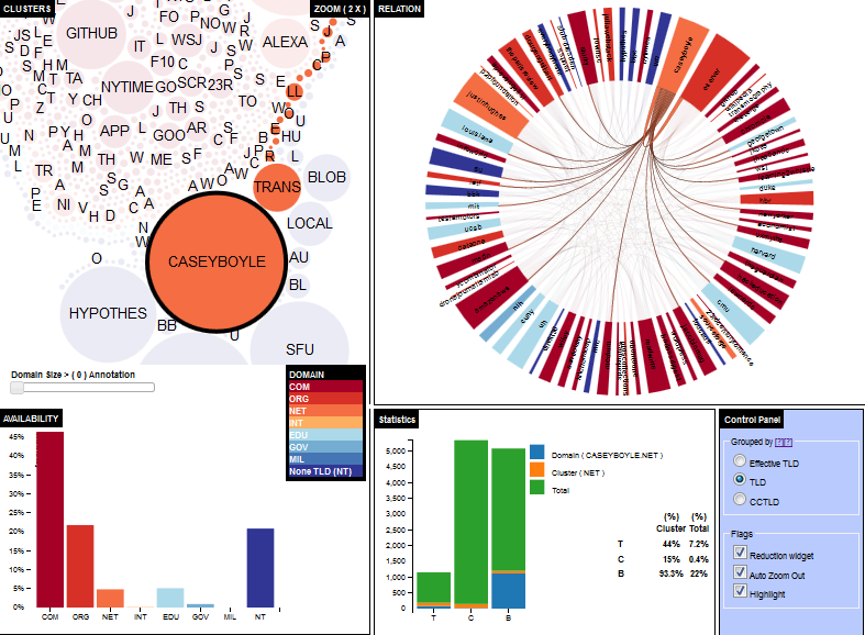 | This Hypothes.is annotation analyzer tool aims to bring together online annotation, visualization, and analysis. The main idea is to provide a unified and dynamic representation of annotated data. The proposed tool allows users and researchers to analyze Hypothes.is data repository and use the possibilities of analysis schemes and graphical visualization for information representation. As the annotation tool considered as a cyclic process the proposed system use statistics and correlation to find the dependencies and relation between annotations. In this paper the annotation visualization facilities of the Hypothes.is annotation analyzer functionality is presented in four interactive juxtapose visualization charts to show the relation between the annotations. The Four charts the system produce are: bubble chart that represents the clusters of the annotations (Cluster Chart), The chord chart to illustrate the relation between domains (Relation Chart), The bar chart to shows the part of whole relation between cluster and dataset (Availability Chart), and The stacked bar chart to show the part of whole relationship between annotations domains, cluster and whole dataset (Statistics Chart). |
Visualizing Annotations in Hypothes.is (Mohamed)
| Recently, web annotation systems have been receiving more attention. These systems help sharing knowledge among users as they are allowed to annotate web resources and reply to other users� comments. Existing web annotation systems, such as Hypothes.is, give their users a limited way to search for information. It is not possible for them to find trends, outliers, or an overview of all data available in their server. In this work, we are introducing an interactive visualization tool to help users understand how annotations are distributed among all domains. By looking at domains which have received large number of annotations, it can be determined whether or not annotations are made for serious purposes. Other information is also can be obtained by this visualization tool such as (1) relationships between domains based on users� tags, (2) a particular user�s annotations distribution among domains, and (3) the change in the number of annotations created over time. |
My Twitter Neighborhood (Alexander and Hassan)
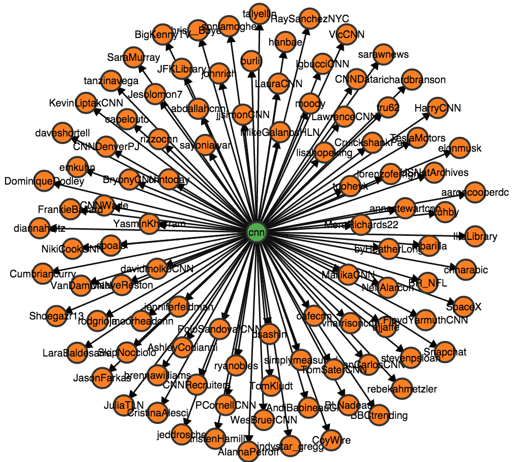 | The rapid expansion of online social networks merits the significant amount of research effort targeting the analysis of social networks. And even though the goal of social networks analysis is manifold such as seeking to identify local and global patterns or the quest to locate influential entities in a network, the goals of visualizing social networks is not diverse: we seek to visualize in order to comprehend the various dynamics of a social network. Consequently, visualizing social networks is an important aspect of social networks research. There are various tools niched in domain needs which visualize social networks. Having explored some of these, we propose a visualization system which attempts to fill some missing functionalities in pre-existing tools, as well as augment or improve others. This was done from an individual�s (Twitter user) perspective. In other words, we propose a visualization system which generates the multi-degree friends and followers graph of a Twitter user, and encodes this data into two standard graph visualization idioms - a Force-directed node-link diagram and an Adjacency matrix. |
ODU Faculty Data Visualization - Mace and Crown (Prasanna and Avinash) This work was also featured in an online article by the ODU Mace & Crown - http://www.maceandcrown.com/2016/01/21/19915/
 | The aim of this visualization is to examine the ODU Faculty salary data and other additional details about each faculty and draw comparisons between each department inside ODU. The authors also analyze the salary data from other states and universities across the United States and compare it with that of the ODU�s salary data. Most of these comparisons were made based on the faculty�s position and the department to which the faculty belongs to. The authors also try to find from which country/state each of the faculty obtained their last degree from and represent it on a global/country map. |
Crime Rate in the US (Ilho and Srividya)
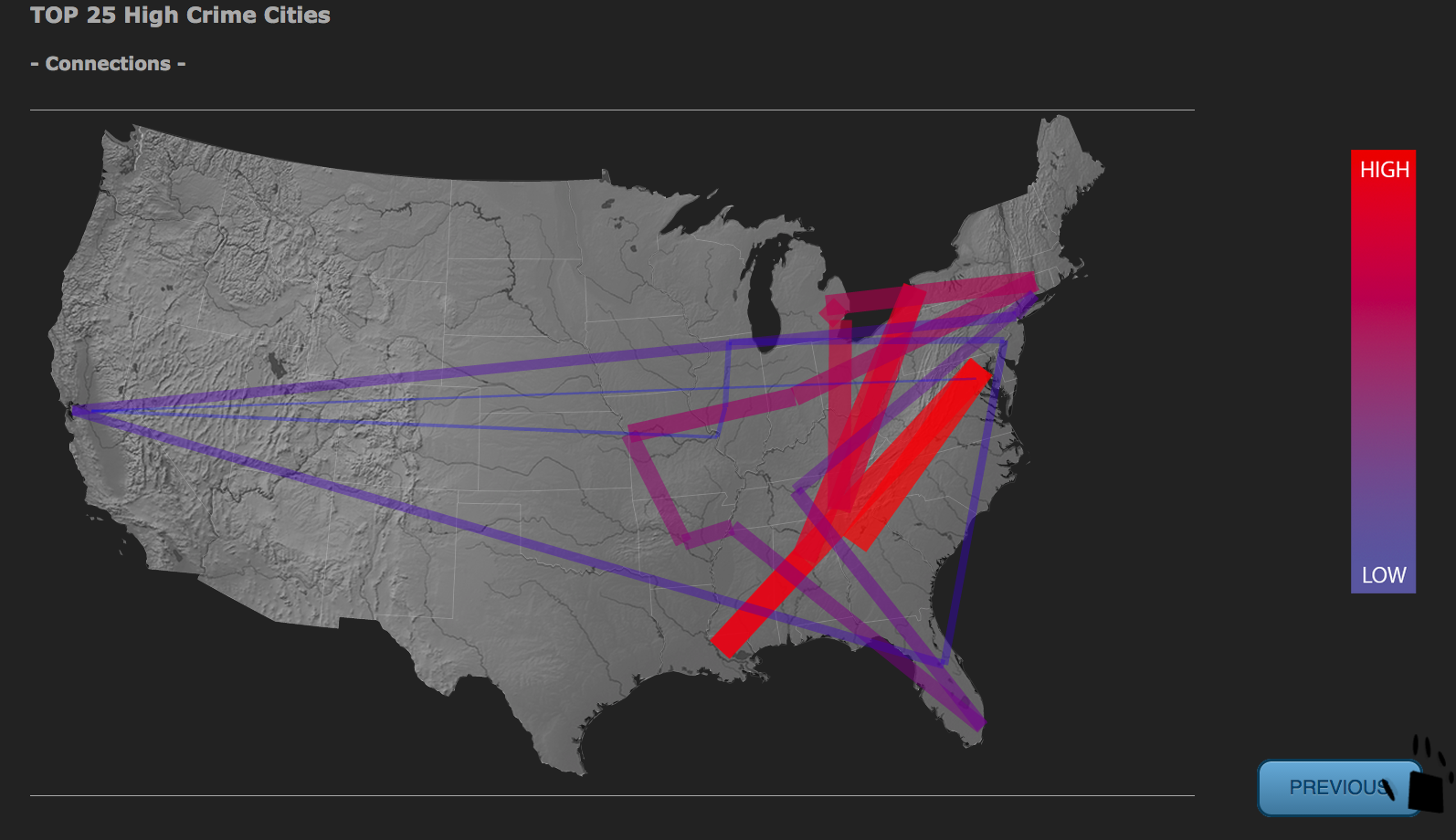 | This project explains why US stands first in the crime. The goal of the project is to know if there is any effect of population, income, and region on the crime rate of the states in US. This has been done by comparing the crime rate with population and income from 2000-2012. Upon observation, it was clear that as income increased the crime in the states started decreasing. Later Top 25 cities with higher crime rate are visualized using a map which gave a clue that even region has a small amount of effect on the crime rate. |
CS 725/825 Information Visualization, Fall 2013
InfoVis 2013 Class Projects @ WS-DL blog
Interactive Visualization of Influenza Spread (Ayush and Reid) | demo video | FluNet Vis @ WS-DL blog
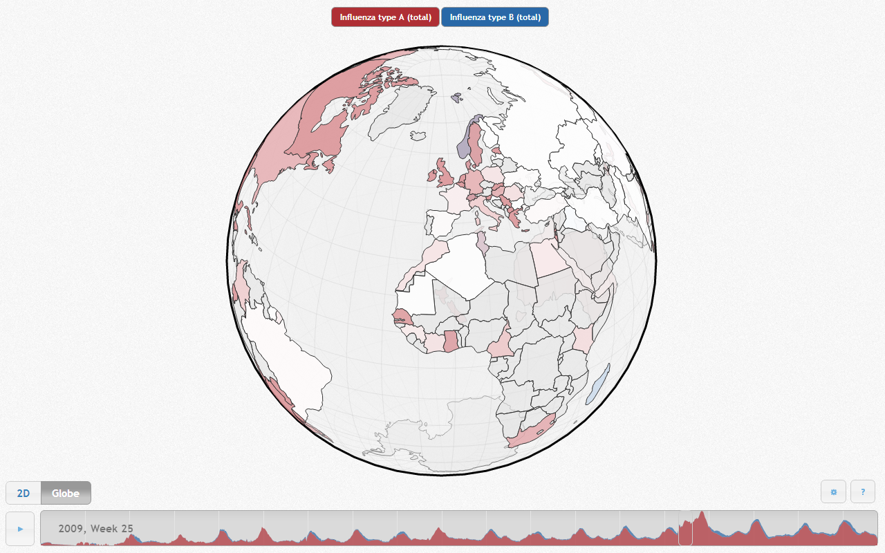 | The Global Influenza Surveillance and Response System (GISRS) has been in operation since 1995, and aggregates data weekly from laboratories and flu centers around the world. The FluNet website was constructed to provide access to this data, but the ability to visualize this data is limited by its outdated, inefficient front-end. In this paper, we present a fresh visualization built around that data showing the propagation of influenza across the globe over time. Our visualization uses Web technologies to present a three-dimensional choropleth globe with color intensity corresponding to infection level. The user can press play and watch the yearly cycle of infection play itself out on the globe's surface. |
Visualizing Currency Volatility (Jason) | demo video
 | There is evidence of a war going on this very instant that is affecting nearly every country in the world. It is the surreptitious appreciation and devaluation of currencies. How can we even be sure such a war is taking place? How is your currency of choice fairing in this war on currencies? It is our intent to provide you with the visualization tools to answer these questions for yourself. |
Visual Exploration of a Controlled Vocabulary - MeSH (Gil) | demo video
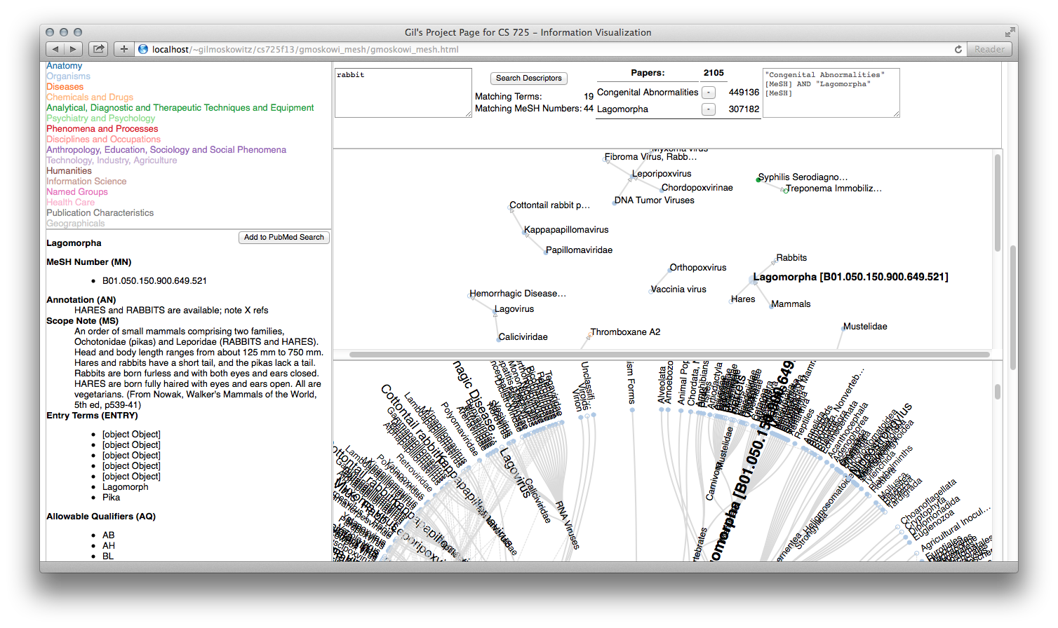 | MeSH is a controlled vocabulary developed and maintained by the U.S. National Library of Medicine (NLM) for indexing biomedical databases, including the PubMed citation database. PubMed queries can be made more precise, returning fewer citations with higher relevance, by issuing them with specific reference to MeSH terms. The database of MeSH terms is large, with many interrelationships between terms. This work visually presents a subset of MeSH terms, specifically MeSH descriptors. The MeSH descriptors are organized into trees based on a hierarchy of MeSH numbers. This work includes a tree view to show the relationships as structured by the NLM. However, individual descriptors may have multiple MeSH numbers, hence multiple locations in the forest of trees, so this view is augmented with a force-directed node-link view of terms found in response to a user search. The terms can be selected and used to build PubMed search strings, and an estimate of the specificity of this combination of terms is displayed. |
Global Infrastructure Trends (Nick)
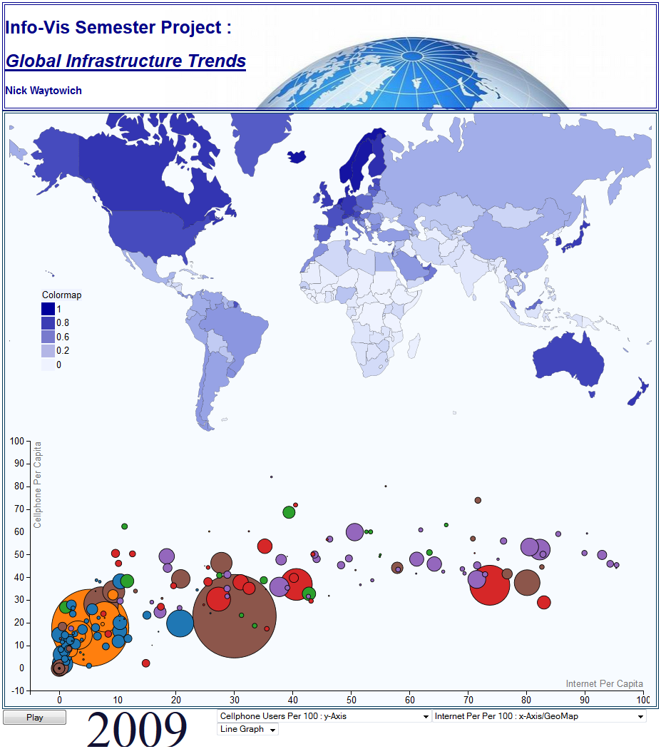 | This project presents a novel visualization tool that can be used to easily visualize and explore global indicator data. The particular use case involves visualization and exploration of global infrastructure trends over the last 20-30 years.More specifically, this tool is being used to analyze the technological revolution in the recent decades by examaning world-wide data measures relating to cell phone subscriptions, internet, broadband subscribers, etc. Though technological advances have lead to wide-spread availability, the distribution of such technologies is still extremely heterogeneous across the globe. The project here was to create and develop a novel visualization tool that will alow for the exploration of these infrastructure trends (as well as any other global indicator) and gain key insigts such as topological relationships of technology use as well as assess the amount of energy generation and consumption and how they relate to the overall technological advancement of a particular country. |
Visualization of Highway Accidents in the US (Sherni)
 | This projects aims at elucidating different ways to present a given dataset for highway accidents and to make these resources available for any user so as to allow them the ability to know different trends with the use of numerous filtering and zooming mechanisms. |
US Broadband Internet (Thomas)
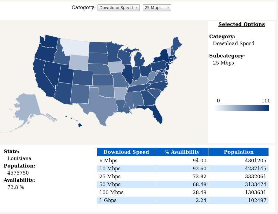 | The goal of this visualization is to provide users a mechanism to explore and analyze United States Broadband Internet data. There is an abundance of data that can be visualized. Current analysis tools limit users to a small subset of the available Broadband Internet data: upload speeds and download speeds. The goal of this tool is to provide a more comprehensive and detailed understanding of U.S. Broadband Internet data. |
BlueVis: Understanding Bluetooth Data (Ahmed)
 | Visualization is an easy way to convey information especially when it is complex. It has been a challenge for the last decade to come up with a simple yet powerful. Visualization is required by a wide aspect of topics as science, journalism, and even children stories. In this paper we will use visualization tools to explore another field of data visualization. Bluetooth is a peer to peer communication technology that has plenty of applications. In this paper we will use visual tools to explore the data collected from Bluetooth signals. Analyzing and exploring these types of signals is done using pure mathematical machine learning techniques that can hardly be visualized. The goal of the work is to come up with a tool that can provide Bluetooth data researchers with an insight on their data. It provides the users with options like: drag, zoom, filtering, feature selection and mapping. |
CS 795/895 Applied Visual Analytics, Spring 2013
InfoVis 2013 Class Projects @ WS-DL blog
You're Gonna Die (Diet) (Mat, Chaitu, Ibrahim)
 | What you consume can kill you, or at least have an effect on how long and well you live. In this paper we put aside other attributes that have an effect on your lifespan and focus on diet. We created and will describe a form-based graphical visualization that allows a user to enter his traits and dietary habits to have an estimate generated for the time left to live and the quantity of time each diet attribute has on lessening this number. |
Disease Outbreak Across Cities (Wayne, Phani, Ranjith)
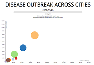 | In the second 2010 VAST Mini-Challenge, a fictitious disease has reached epidemic levels across the world. Our goal was to describe the spread of the disease, and compare the outbreak across cities. For each city, two data files were supplied. One included hospital admittance records. This file listed the age, gender, identification number, and symptoms for each patient admitted to a hospital. The second file listed the identification numbers and dates that patients died. Our visualization compares the outbreak across the cities over time. Cities are plotted based on the number of infections, number of deaths, and the mortality rate. An information section is included at the bottom which lists more detailed statistics for each city. This section breaks down infections, deaths, and death ratio on gender and age group. |
Life in Hampton Roads (Ben, Adarsh, Rahul) | demo video
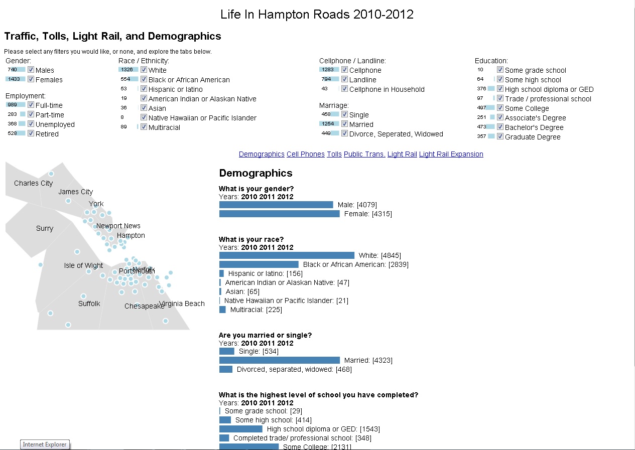 | Life In Hampton Roads is phone survey conducted for the years 2010, 2011 and 2012 in Hampton Roads. Data Cleansing is done with the help of tools like Excel and Google Refine The survey data is shown using visualization technique making it more interesting to understand public opinions on a particular question. Visualizations are created by using various tools like D3, Javascript, JQuery and HTML. The visualizations implemented in the project are reader-driven and exploratory. |
Life in Hampton Roads - 2 (Andrew W., Timothy, Harshith)
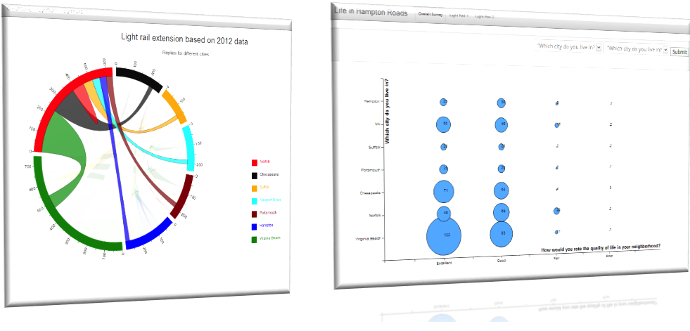 | Surrounding the citizens of Hampton Roads are vast and varying opinions on the area in which we live. The demographic nature of a military-based region, complete with a metropolis, sprawling suburbs, and an oceanfront resort, is perceived to be quite diverse and complex. An ongoing survey entitled "Life in Hampton Roads (LIHR)", performed at Old Dominion University in Norfolk, VA and led by Dr. Tancy Vandecar-Burdin, aims to "develop of baseline of social/economic indicators for use by local government and other community orgnanizations." In an effort to more clearly visualize the outcomes of this survey, we have applied common InfoVis techniques to develop a simple application that displays the data in a more human-friendly fashion. |
Where Shall I Stay, People Like Me (Andrew S., Mohan, Ujwal)
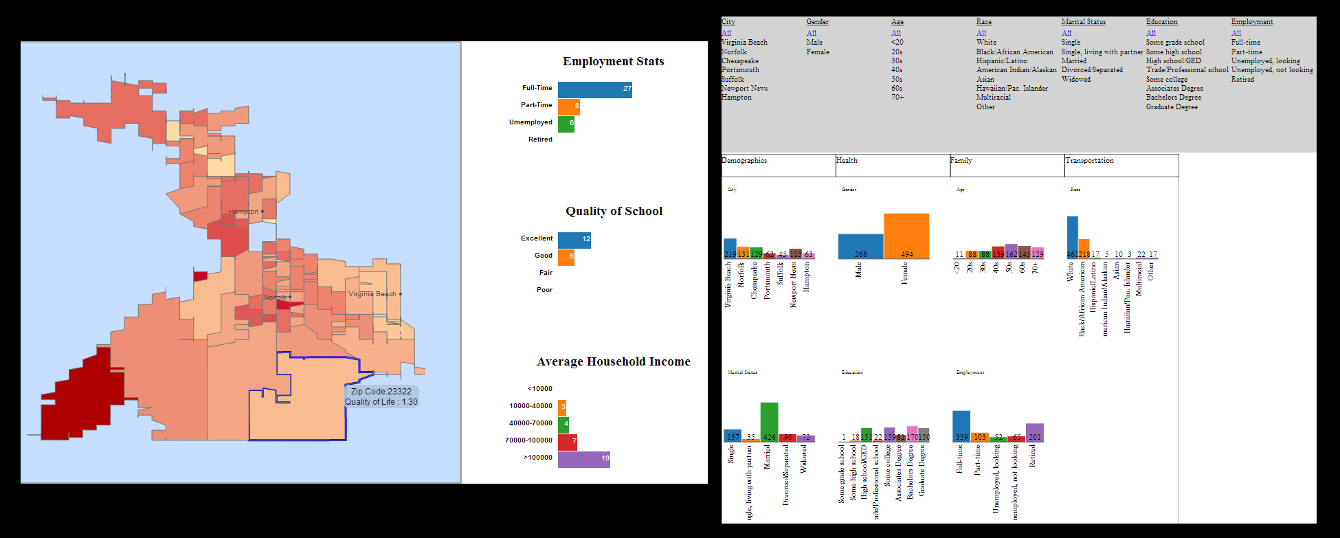 | This project focusses on attitudes and perception of citizens regarding topics of local interest such as transportation and traffic, health, crime and other issues. We present a map of Hampton roads with zip code borders and for each zip code we pull up statistics about crime, traffic and demographics using bar charts. |
CS 795/895 Information Visualization, Fall 2012
All groups investigated emerging trends in quantum sensing. For more info, see the Infographics Contest page.
InfoVis Fall 2012 Class Projects @ WS-DL blog
Wayne - contest winner | demo video
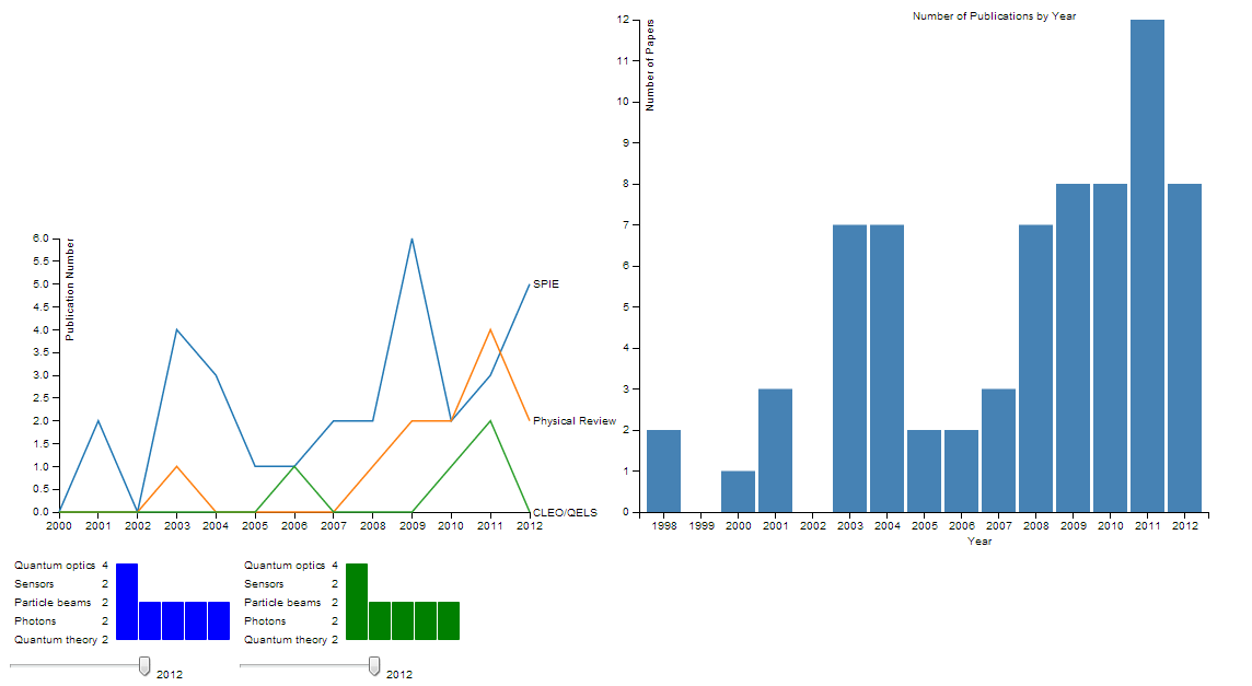
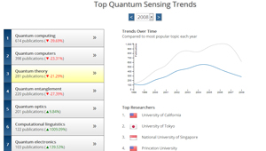 | In this paper, I present a visualization for displaying the history and trajectory of quantum sensing. History is shown as a year-by-year slideshow. The most publicized quantum sensing areas for the selected year are displayed. Clicking on a topic shows the amount of publications on that subject over time. This allows users to see when a subject started to rise in popularity, and at what point in time (if any) it started to decline. The visualization also shows which research groups have the most publications for the selected subject. The final slide in the visualization is a projection for the year 2025 to show where quantum sensing is headed in the future. |
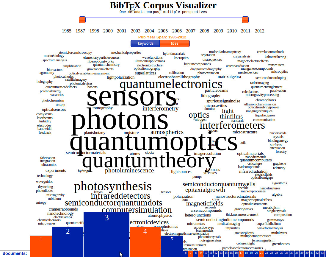 | One method to find trends in any industry is to examine the publications related to that industry. Given a set of publications, one should be able to extrapolate trends based on solely on the publications' metadata, e.g., title, keywords, abstract. For one to analyze text data to determine trends is daunting, so another method should be used that analyzes this data and presents it in a way that can be easily consumed by a casual user. This casual user should be be able to achieve the goal of identifying trends in the respective industry. In this paper I have created a visualization that examines a small corpus consisting of metadata (BibTeX) about a collection of articles related to Quantum Sensing. Based solely on this data, I am able to provide an interface that allows a user to explore this data and conclude many attributes of the data set and industry, including finding trends. |
Lulwah and Mostafa
 | In this project, we were interested in predicting emerging technology trend in quantum sensing. For the project, we were provided with datasets of publication related to quantum sensing. The data initially gathered by searching "Term of Keyword" related to quantum sensing. The initial dataset has 70 papers related to different field of quantum sensing. The dataset contains title, abstract, year of publication, authors and keyword index. During the project we have extended the dataset by addition following contents; affiliation of the author and the content of paper if it was available to public. In addition, we extracted the keywords from the dataset that are related to quantum sensing. As like many visualization project, In this project, we had to deal with the challenges of cleaning, filtering and organizing the actual raw data. At the beginning of the project we had to do lot of manual cleaning and filtering of the data. Later we use organize the extracted data into several parts in order to make it useful for visualization. |
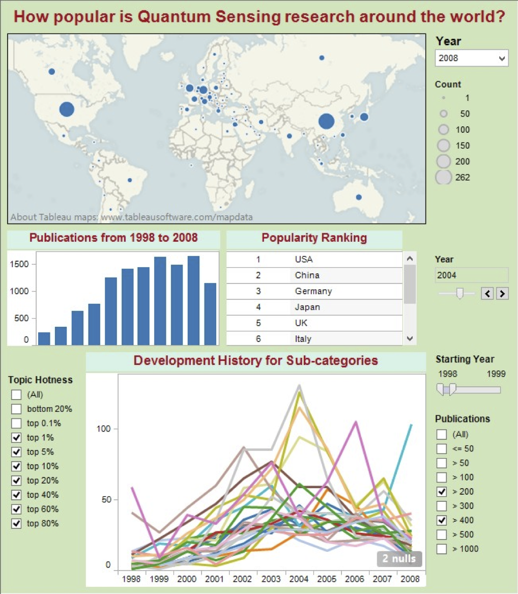 | Before investing time, funding and valuable resources in a research area, researchers and investors need to be prepared with a good understanding of its development and growth trends, including detecting growth patterns, identifying interesting exceptions or changes, and predicting potential future via analyzing a large number of statistical data. A good visualization can effectively facilitate these tasks and transform data into useful information. In this project, I apply powerful visualization techniques and design principles to implement an interactive visualization for analyzing development trend of quantum sensing technologies. The visualization abstracts interesting information from a large-scale dataset and clearly represent the data. Interaction methods are adopted also, which allow users to zoom and filter, highlight and query more detailed information. Researchers and scientists can take advantage of this visualization to obtain insights as where and when the quantum sensing research started, how a specific research topic is developed, and what is the potential future of a research topic. Based on the visualization results, users can get clues for investment decisions. |
Abhishek and Ben
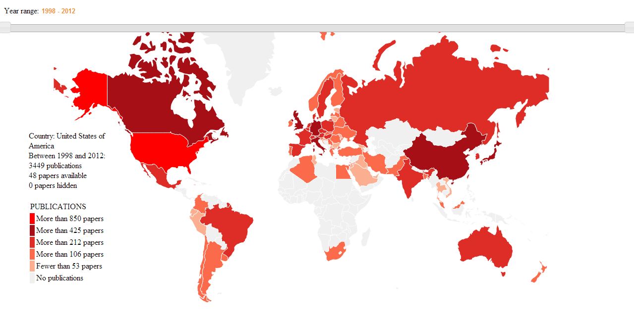 | Often data provides much information regarding itself than we can infer. Many times we cannot gain insight about the data by just looking at it. It hides some of the information. So, need arises to visualize the data, where we can gain insight about the data itself. As gaining insight about the data is the main purpose of visualization, we thought of visualizing the data. This is where the words of Ben Shneiderman comes to my mind, "The purpose of visualization is insight, not pictures". Our goal was to visualize the data i.e., the papers on a world map. |
Andrew S.
 |
Andrew W.
 | The United States Air Force is interested in detecting new trends in technological research, namely Quantum Sensing. In many cases, the most effective way to boost a project dealing with data analysis is to visualize the data at hand, which entails seven steps: acquisition, parsing, filtering, mining, representation, refining, and interaction. Throughout these steps one can turn a set of raw, unreadable data into a useful visualization that can depict trends, stories, relationships, and sometimes all of the above. I propose a tool that will allow the Air Force to determine which fields of research are popular, detailed with trends per year and field. |
CS 795/895 Information Visualization, Fall 2011
InfoVis Fall 2011 Class Projects @ WS-DL blog
We Feel Fine: Visualizing the Psychological Valence of Emotions (Elliott and Corren) | demo video
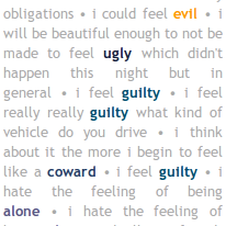 | 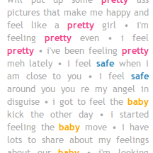 | We present a methodology for quantifying the nature and intensity of emotional states across various demographic spectrums as noted in emotion-laden text. By incorporating an assessment of the specific words related to feelings found in blogs, we quantify psychological valence (i.e. happiness) on a continuous 1 to 9 scale using a standardized, discrete word list. Our method incorporates elements of a multi- dimensional model which differs from the traditional classification systems which are based primarily on subjective, qualitative measures. Further, we introduce a visualization method that couples a histogram which spans emotional states with a word frequency bar chart which allows exploration of temporal content changes in the language used to express emotions. We refer to this visualization technique as a "valence bar." |
Visualizing Digital Collections at Archive-It (Kalpesh and Yasmin)
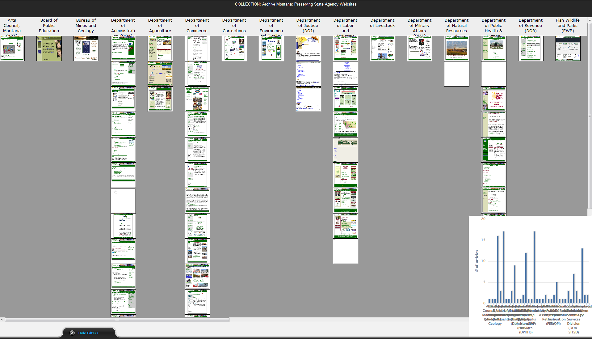 | Archive-It, a subscription service from Internet Archive, allows users to create, maintain and view digital collections of web resources. The current interface of Archive-It is largely text-based, supporting drill-down navigation along lists of URIs. With the lack of proper moderation, many collections are poorly curated making them difficult to explore. In this work, we introduce two visualizations for exploring these archives and gaining insight about the collection. |
K-12 Archive Explorer (Sawood and Chinmay) | demo video
 | K-12 Web Archiving is a program designed for high schools in partnership with Internet Archive and the Library of Congress. The program has been active since 2007 and allows students to capture web content called collections and archive it for future generations. These archives could provide a strong resource for future historians who will study our lives. The program will help preserve the history and culture and provide an insight into trends, research and thinking patterns of current generations. In this paper we propose a web based application that helps to aggregate this vast collection of information. The explorer provides the students with a single interface for fast exploration and visualization of the K-12 archive collection. |
Exploring the World's Earthquake Data (Ahmed and Kumar)
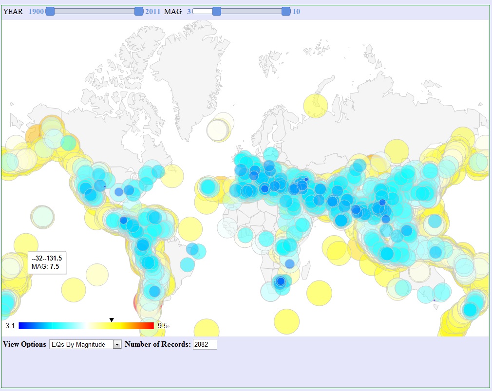 | We present new ways to look at the raw earthquake data from 1900 up to 2011 using interactive JavaScript maps and charts. Based on our generated visualizations, we will analyze the data and try to find general patterns. |
Virginia Port Authority - Import/Export Explorer (John and Andrew)
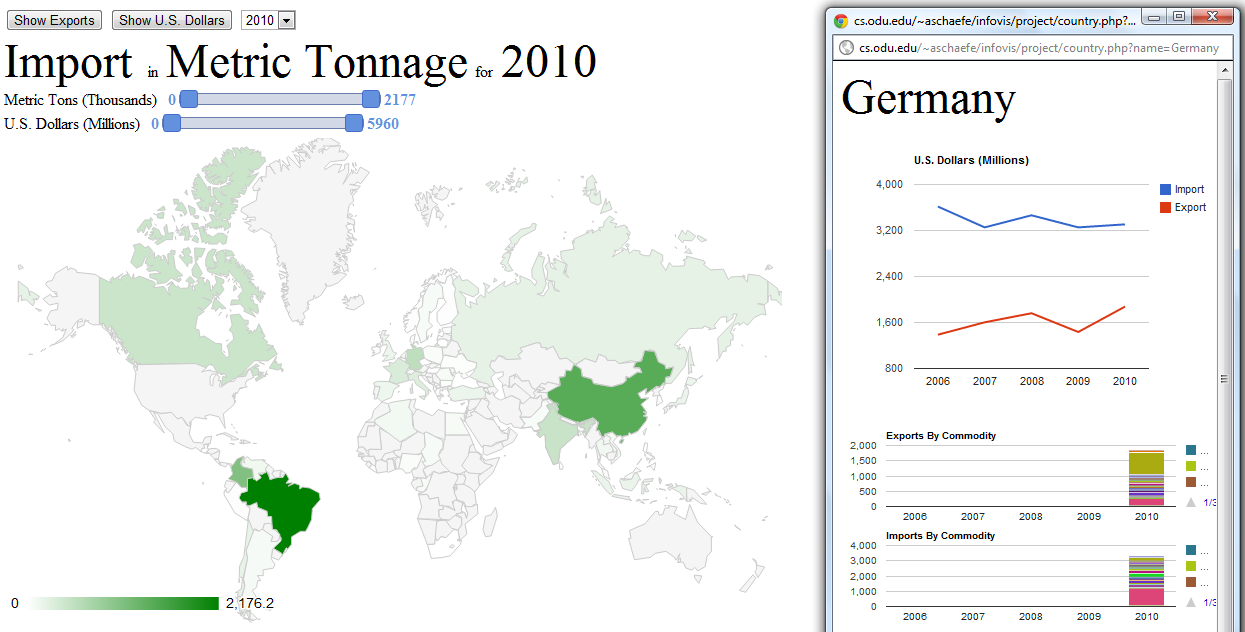 | Global trade has a plethora of data. However data is not information. Data is simply a collection of facts for reference. Information however is data that is provided for you, that is a part of a learning experience. The visualization of Trade data allows for a transformation of data into information. The Import/Export Explorer's purpose is to help inform a user on trade. Which nations have the highest export in U.S. Dollars? What nations provide the largest tonnage of trade each year? How are the trends moving in each of the nations? Through use of data provided by the Virginia Port Authority and the tools created by Google Chart API, Import/Export Explorer will provide clues to answering these questions. |
Wikipedia Page View Analyzer (Timothy)
 | This work is a visualization for analyzing page view statistics for the popular website Wikipedia. The visualization allows users to interact with it, to filter down articles and to begin researching various data points that they find of interest. |